Skip to content
Skip to search - Accesskey = s
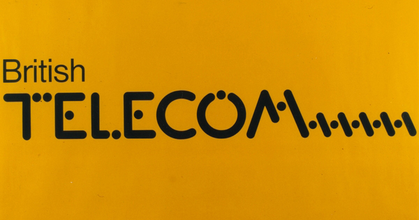
This great analog morse code inspired logo was used by British Telecom from 1980 – 1991. Often only the ‘T’ (-) was applied as a branding / logo, which worked very well, even as a relief on their products!
leave a comment
Fill in your details below or click an icon to log in:
You are commenting using your WordPress.com account. ( Log Out / Change )
You are commenting using your Facebook account. ( Log Out / Change )
Connecting to %s
Notify me of new comments via email.
Notify me of new posts via email.
Δ
Welcome to my page showing a selection of recent design endeavours and some observations on the topic of design & the culture of objects
leave a comment