Old meets new

Paul Smith shop in Albemarle Street, central London designed by 6a architects
A fantastic example on how to integrate a contemporary shop front design into a heritage environment, without resorting to pastiche. The intricacy of the contemporary cast iron panels & railings marries the texture of the old facade, making both old and new stand out.
Look at me, look at me
A bit of fluorescent tape and you’ve got attention, even if you have been around for hundreds of years.

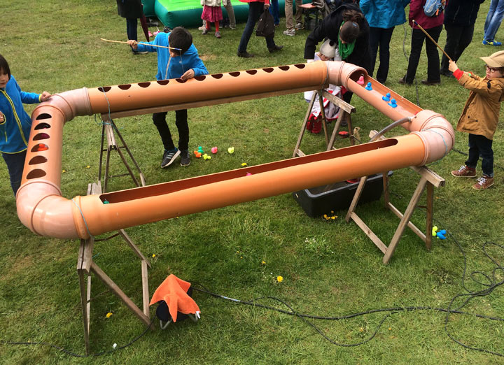
The right type of scale

DIY magic
 Magic tape must be one of the best office inventions after the post-it. In combination with low-budget DIY needs it becomes even more magic, as I’ve noticed on this door of an Architects studio in Barcelona…
Paris bashing
It is well known that the bistro culture in Paris is a league on its own, sitting tightly packed on street corners, coffee & cigarettes, waiters that don’t care, gazing at the people passing by …
The typical Paris bistro table with a single foot and an oversized thin metal edging embodies this way of life quite well for me. Every bash and knock the metal edging gets adds character & texture to the table, making it age gracefully without aspiring to be perfect.

Matching graphics
 “Your penny is worth more at the Cooperative supermarket” is a great slogan, and the graphics on these match boxes are even better. Not sure from which period this is ( I would guess late 70’s early 80’s), but I wish retail graphic design would more often be this convincingly simple, minimal, bold & confident (even if it looks a bit communist).
Cheap & cheerful

Creating a street stall for a one day event to sell hand made scarves from Bangladesh is not my usual design brief, especially if the budget had to be kept at an absolute minimum. But there is always a way, even if it means going to the DIY shop..
Scarves designed by Luxembourgish designer Anne-Marie Herckes with the assistance of the Vocational Training and Employment Generation Project of the NGO ‘Friendship’.
Quality banking

Interior concept for the 74 branches of the Banque et Caisse d’Epargne de l’Etat, a national institution in Luxembourg – designed by Teisen-Giesler Architectes & Georges Zigrand Design Consultancy
We elaborated a scheme conveying the notion of safety, tradition, quality and long established values. By emphasising solid build elements made from cast terrazzo and oak we underlined the trustworthy image of the bank. Timeless shapes and high quality materials should also underline the fact that the bank, with it’s long history, is here to stay.
The design proposal were elaborated following an closed competition initiated by the BCEE.
Beads & buttons fun

I saw this ingenious way of displaying buttons in a Madrid shop. The big wheely device looks more like something from a fun fair and turns at will in order to best view all the buttons on display.
This principle could also be used in many other contexts like interpretative devices in museums …etc. And of course as a way of visually displaying information on the i-phone…
Chez Jeannette

The more you can do with LED technology the keener I get of the old fashioned neon sign aesthetics. I saw this great neon sign in Paris above the bar of the Café Jeannette, rue du faubourg Saint Denis. I very much like the way it extends into an architectural feature delineating the space of the bar and not limiting itself to just be a sign.
It also made me think of the great Kraftwerk song ‘Neon Lights’:
Shimmering neon lights
And at the fall of night
This city’s made of light…
Shopping info point in Luxembourg city
A very small but dynamic, elegant and highly versatile space commissioned by the Union Commerciale de la Ville de Luxembourg.
Primarily it is a place where visitors can get any shopping information (opening hours, retail services, maps, customised shopping trails …etc) the city has on offer. Within that primary task of giving out information it is also a place where the city’s retailers can celebrate particular themes and organise special events & exhibitions.
Furthermore, the second aim of the space was to establish best practice retail design with innovative materials and finishes. The floor is made from two coloured resin floor (made from cast Polyurethane). The grey brown floor is split in the middle by a central band of white that invites the visitor in from the outside. This band is then folding up to create a central display made from thermoformed partially back-lit white Corian sheets.
By contrast, all the walls are lacquered in a warm dark and super mat Nextel paint finish. This material, often used on control panels and dashboards, is hard wearing and extremely light absorbing to minimise light reflections and emphasis the artifacts & displays. Moreover, the lighting is kept low to focus on the displays and create a beautiful museum like experience.
Cramped into an area of only 50m2 the space is packed with multiple functionalities while keeping a sober and high-quality appearance.
No design sign
When you walk around city centres you have to wonder if we need all that signage and graphic design. Often too slick, too loud and too perfect, over-designed corporate identities and graphics take away the human side of things. Maybe there are too many designers around that need to find work (and not enough courageous businesses).


leave a comment