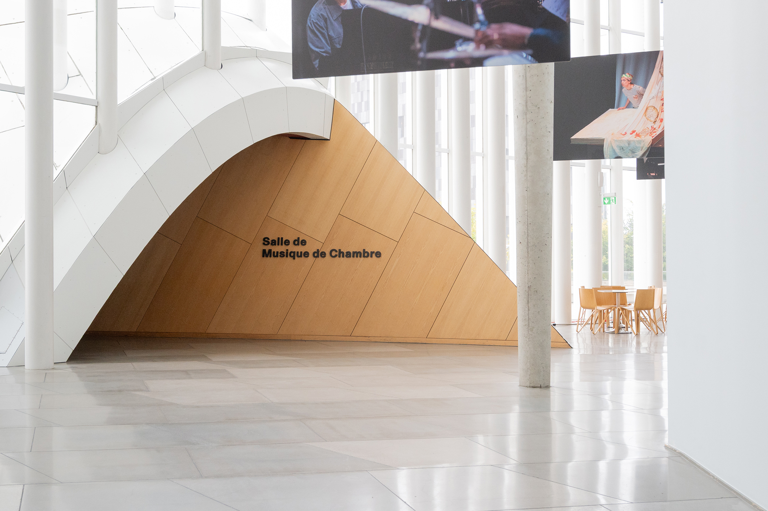
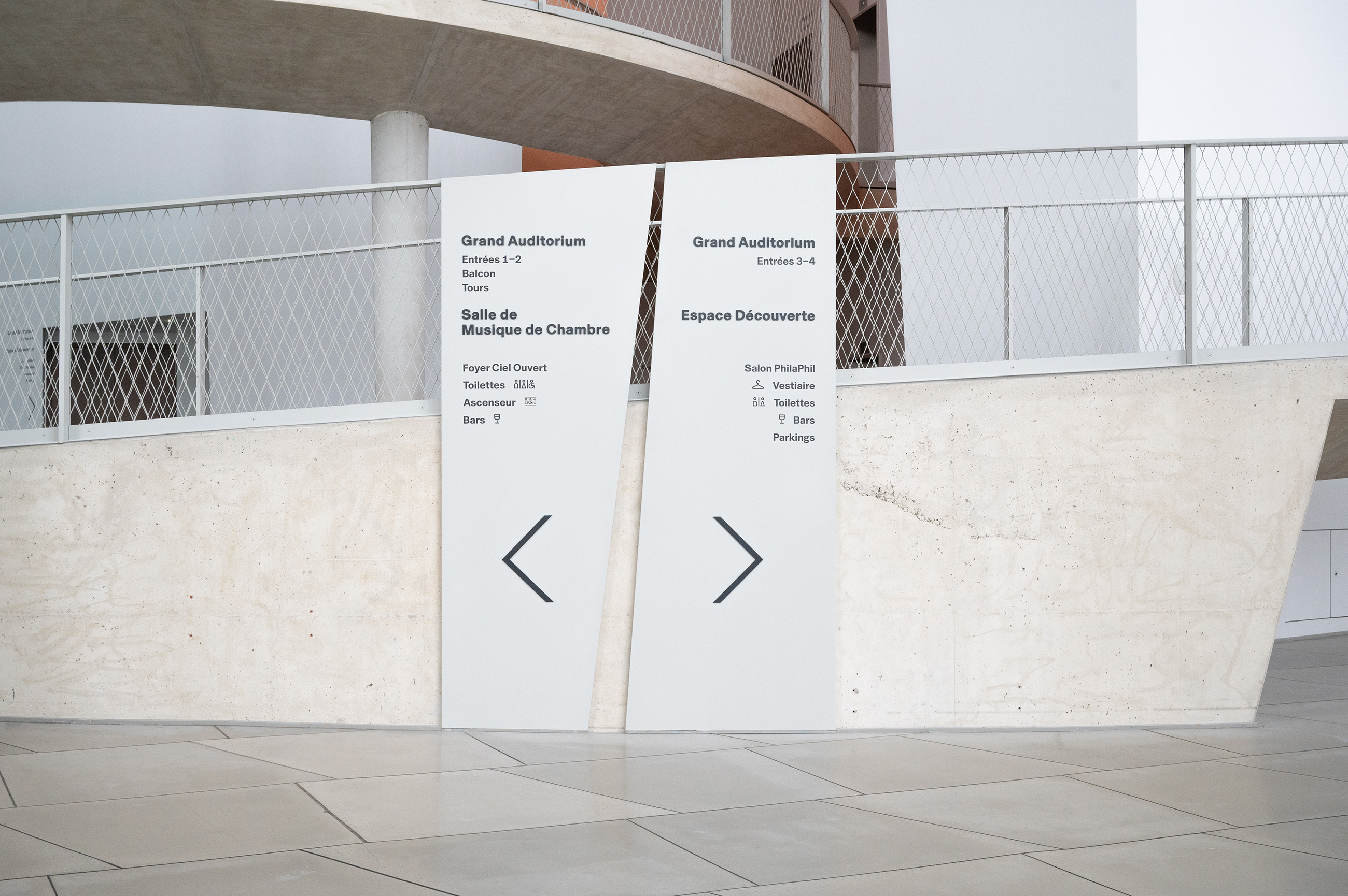
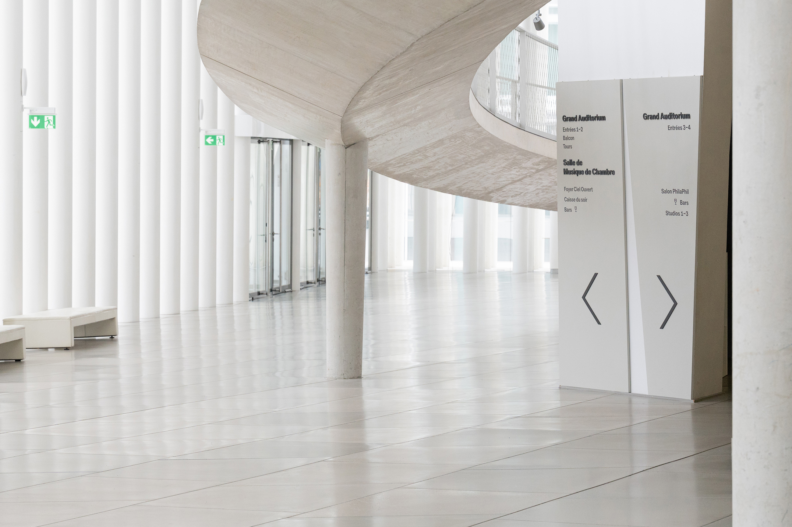
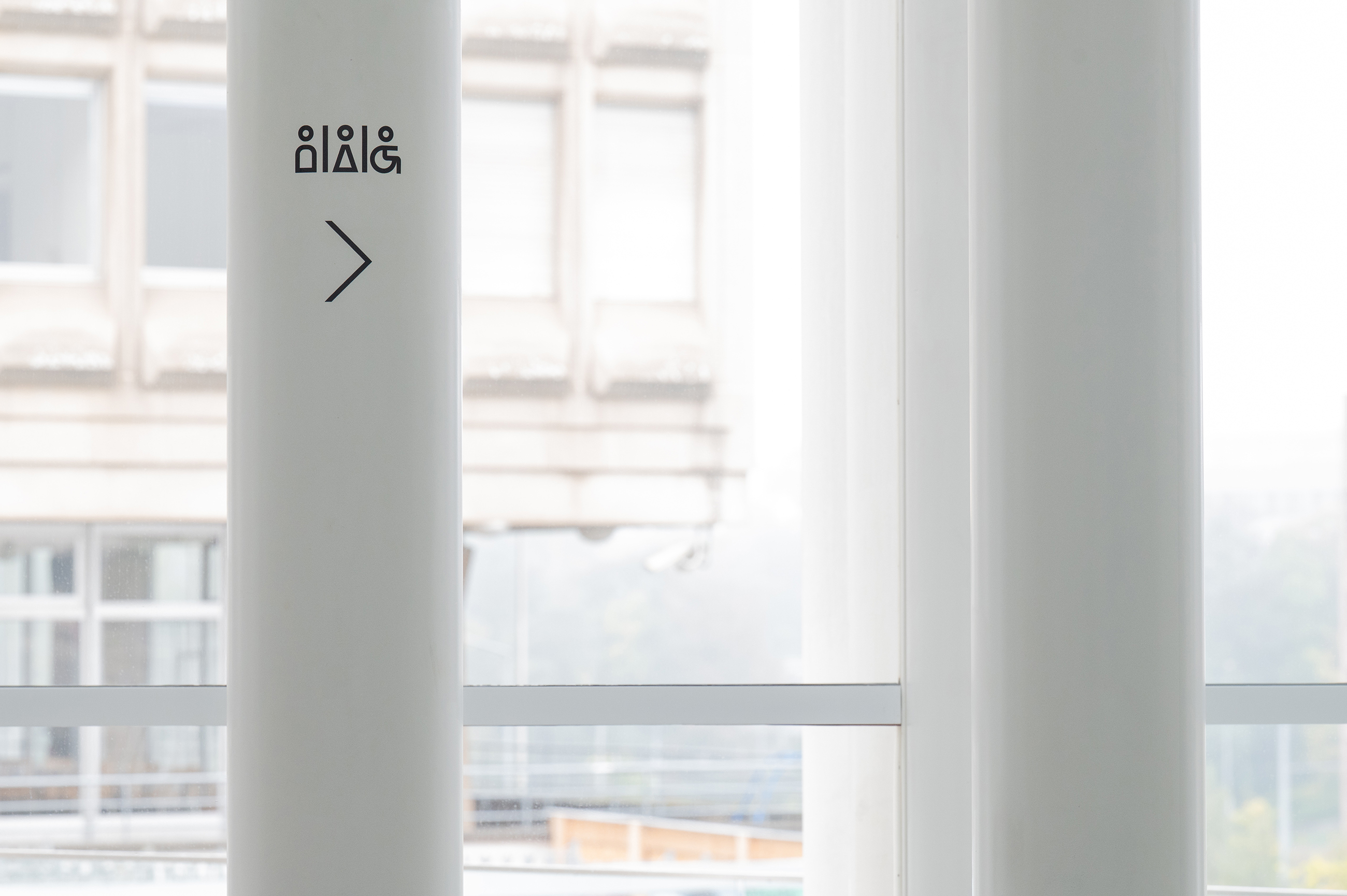
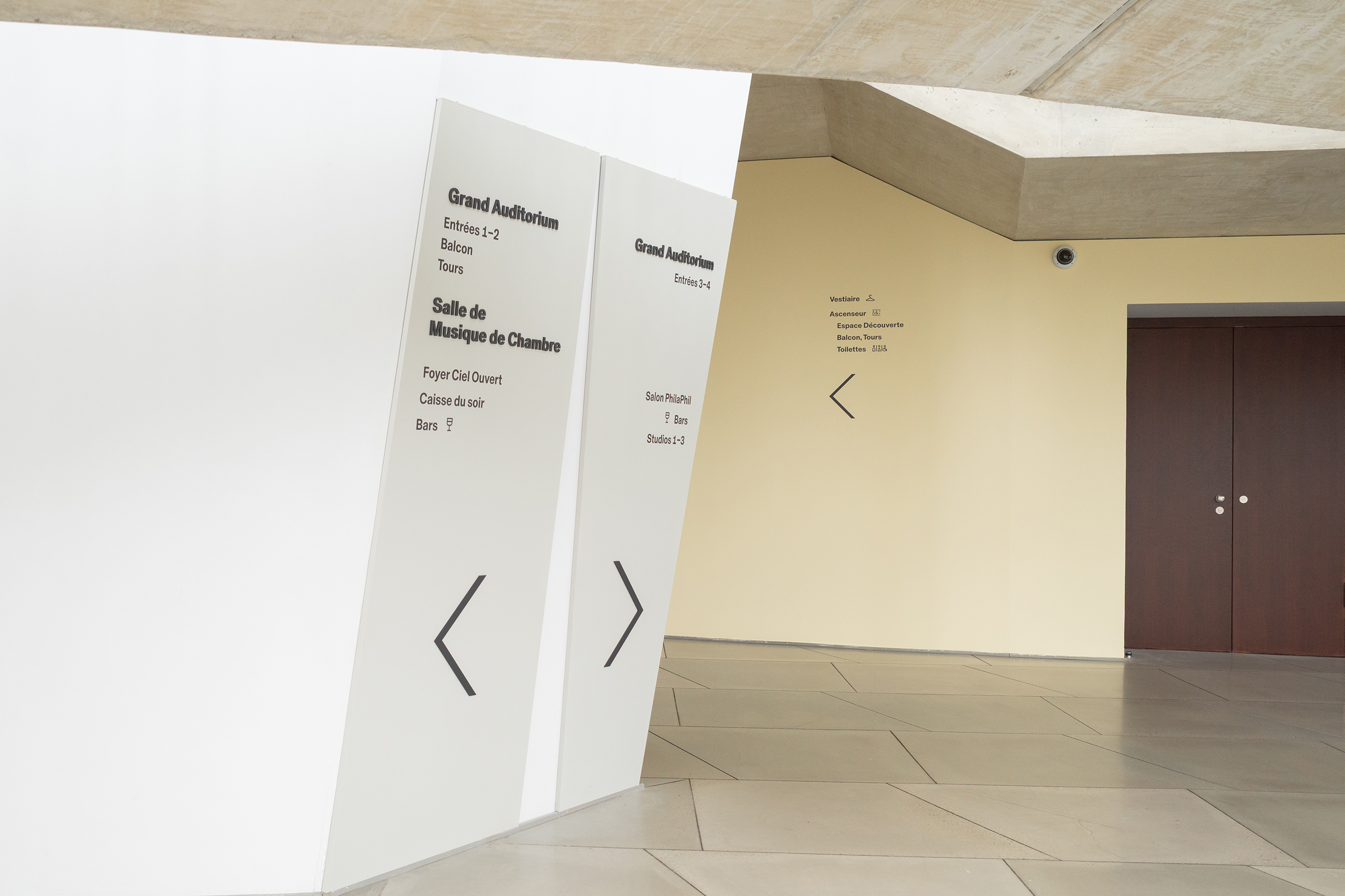
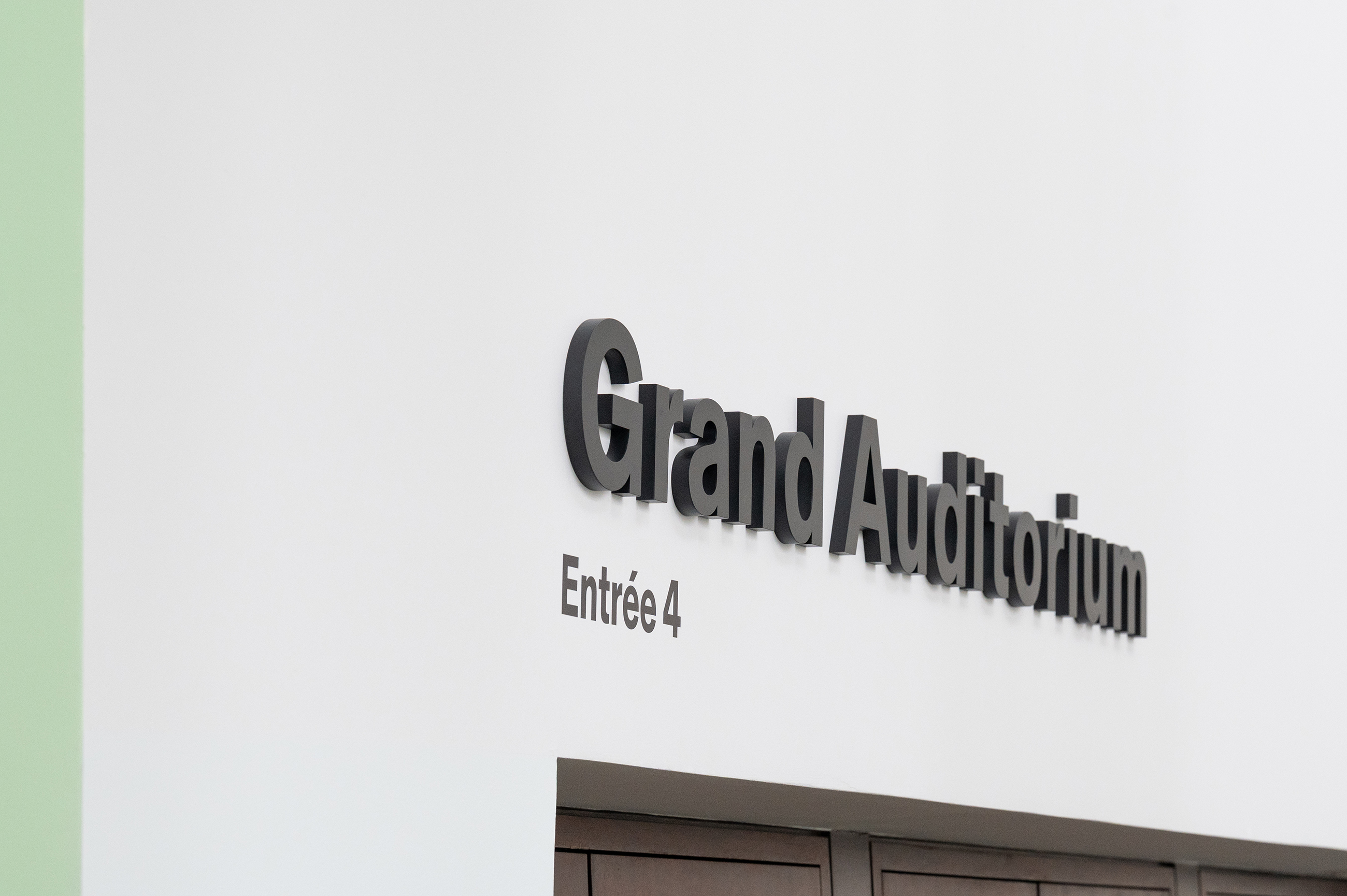
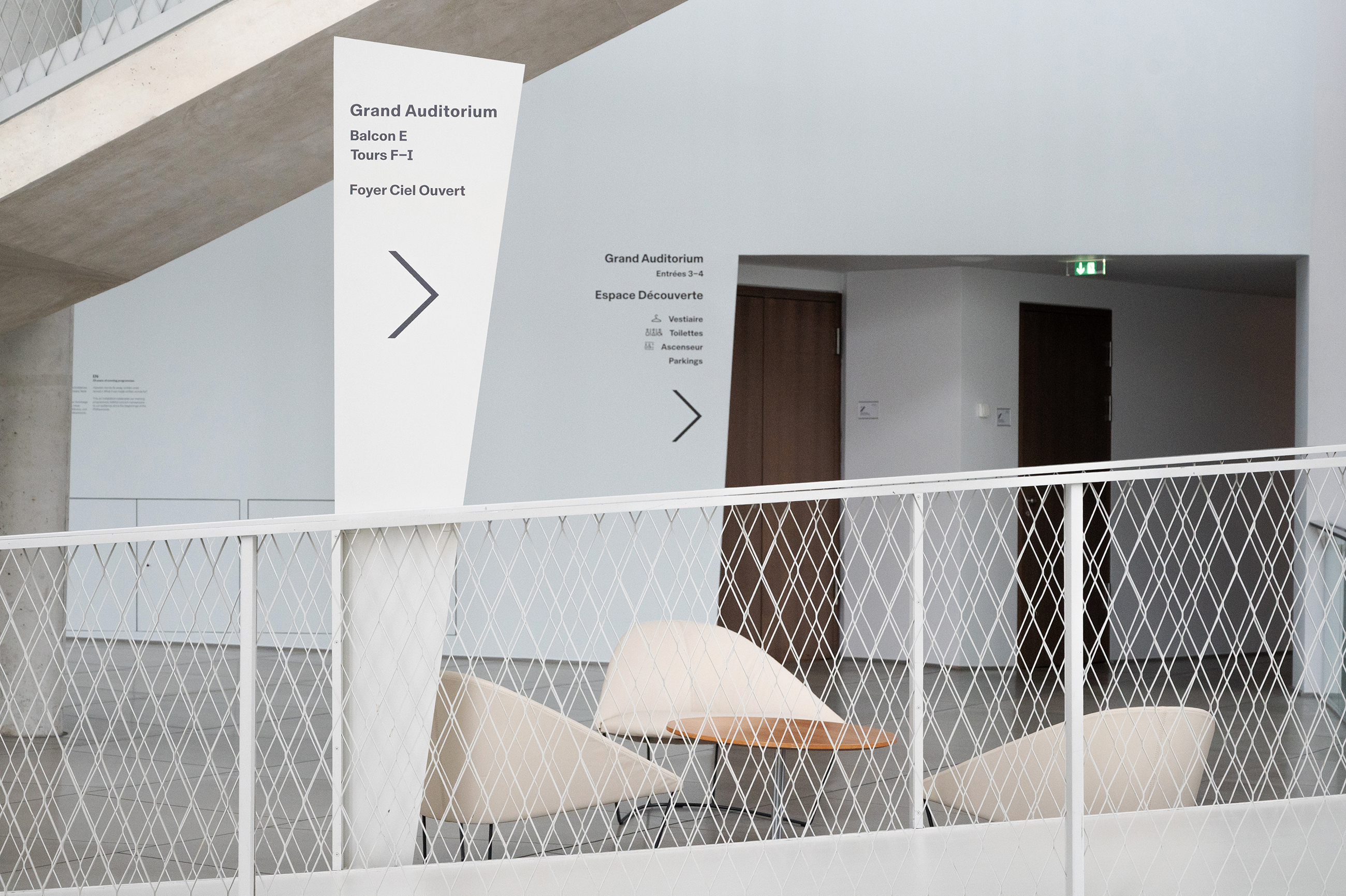
New Philharmonie Luxembourg signage project
We were asked by the Philharmonie Luxembourg to rethink and overhaul the existing signage of this amazing building, designed by architect Christian de Portzamparc and inaugurated in 2005. The process of designing a coherent signage scheme in this complex building, which has almost no straight walls ( if there were any walls at all ) and no level floors, was one of our biggest design challenges so far. In fact, the angled asymmetrical walls, slopes, tunnels, towers and a circular circuit made our heads spin more than once. In close collaboration with the Philharmonie team, it took a year of structuring a new hierarchy, changing denominations, testing mock-ups, trials & errors, to develop a new concept.
The new design scheme had to find numerous specific three dimensional support solutions in order to have a minimal impact on the architecture and integrate into the very specific formal language of the building. Throughout the design development we followed our initial intention of trying to be as subtle as possible, yet at the same time, to be clearly visible and confident where required. Ultimately we arrived at an overall scheme that feels like it has always been part of the building, intuitive for the visitor and in accord with the architecture.
Client: Philharmonie Luxembourg
Graphics: Laurent Daubach / Designbureau


All photos © Philharmonie Luxembourg / Inês Rebelo de Andrade
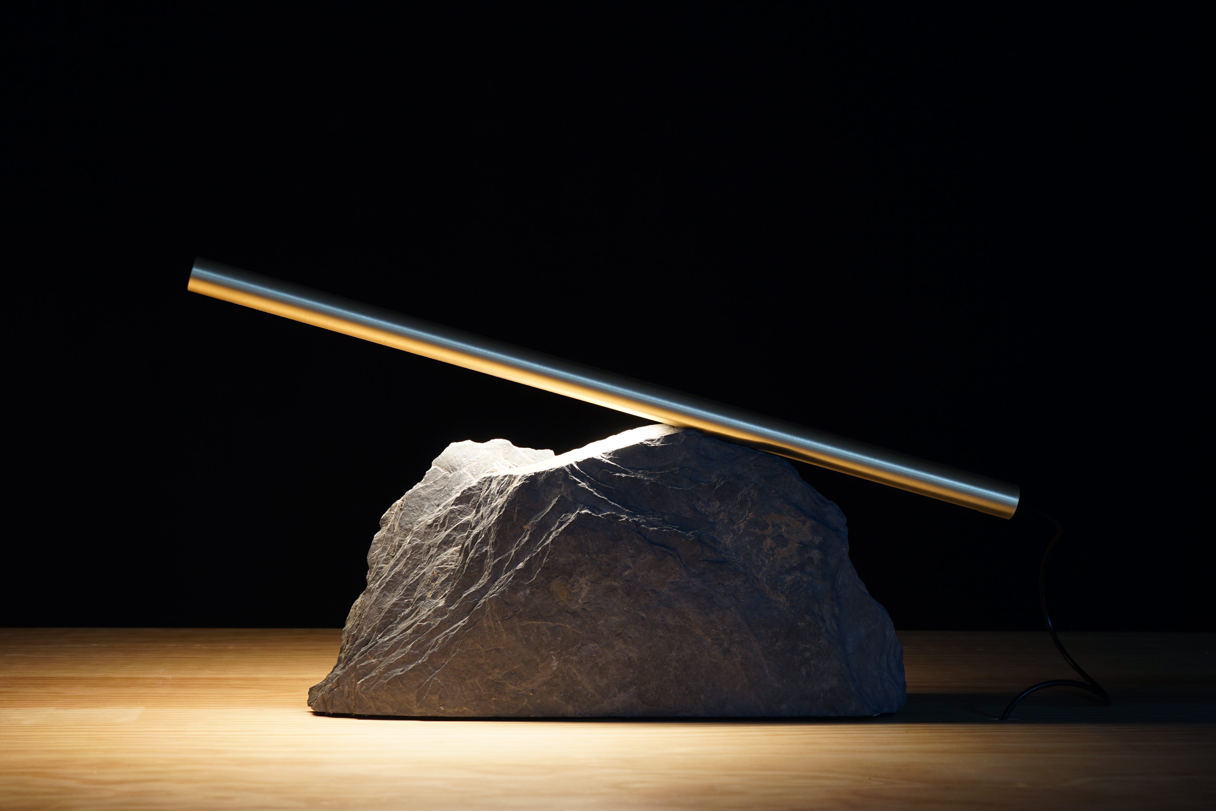
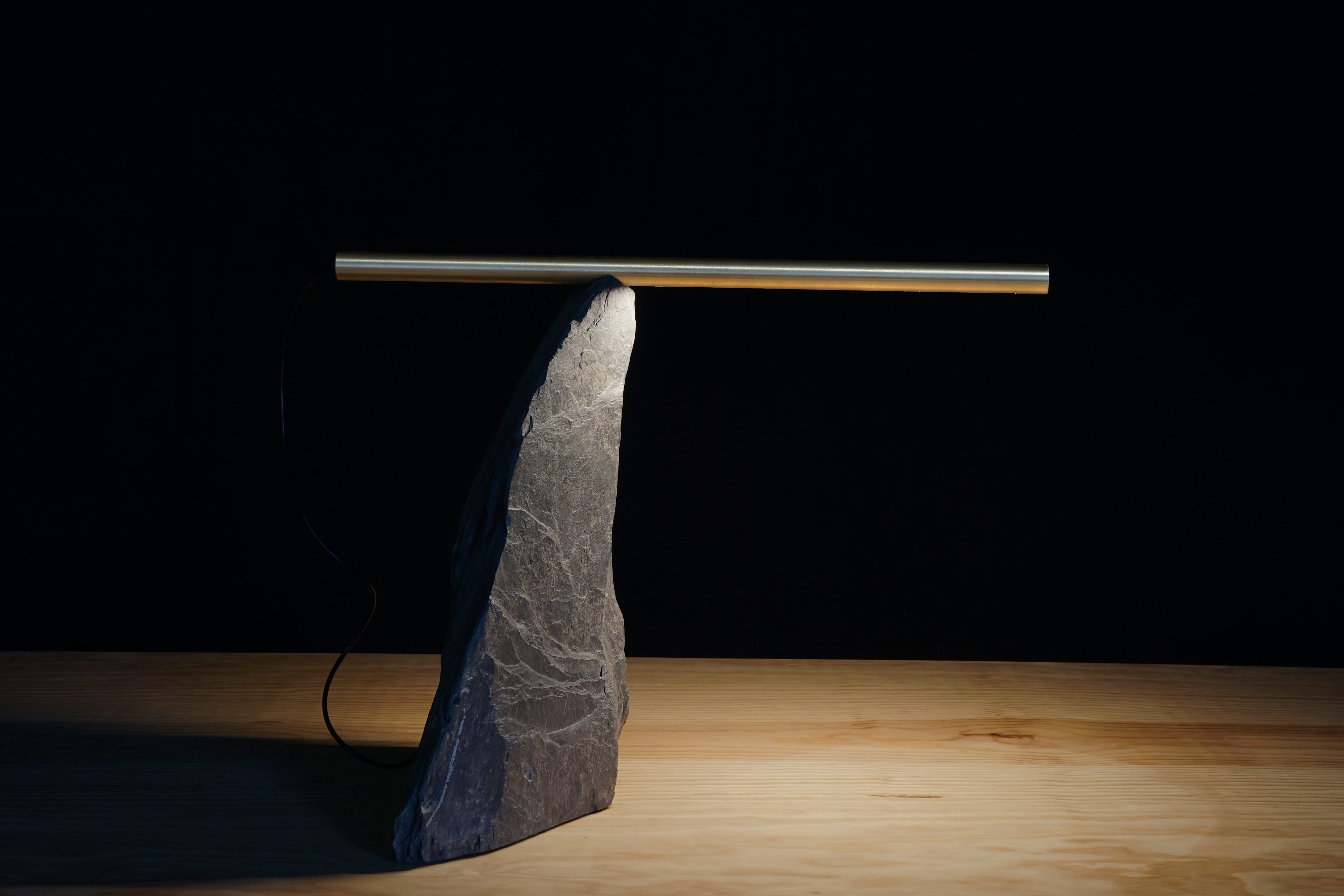
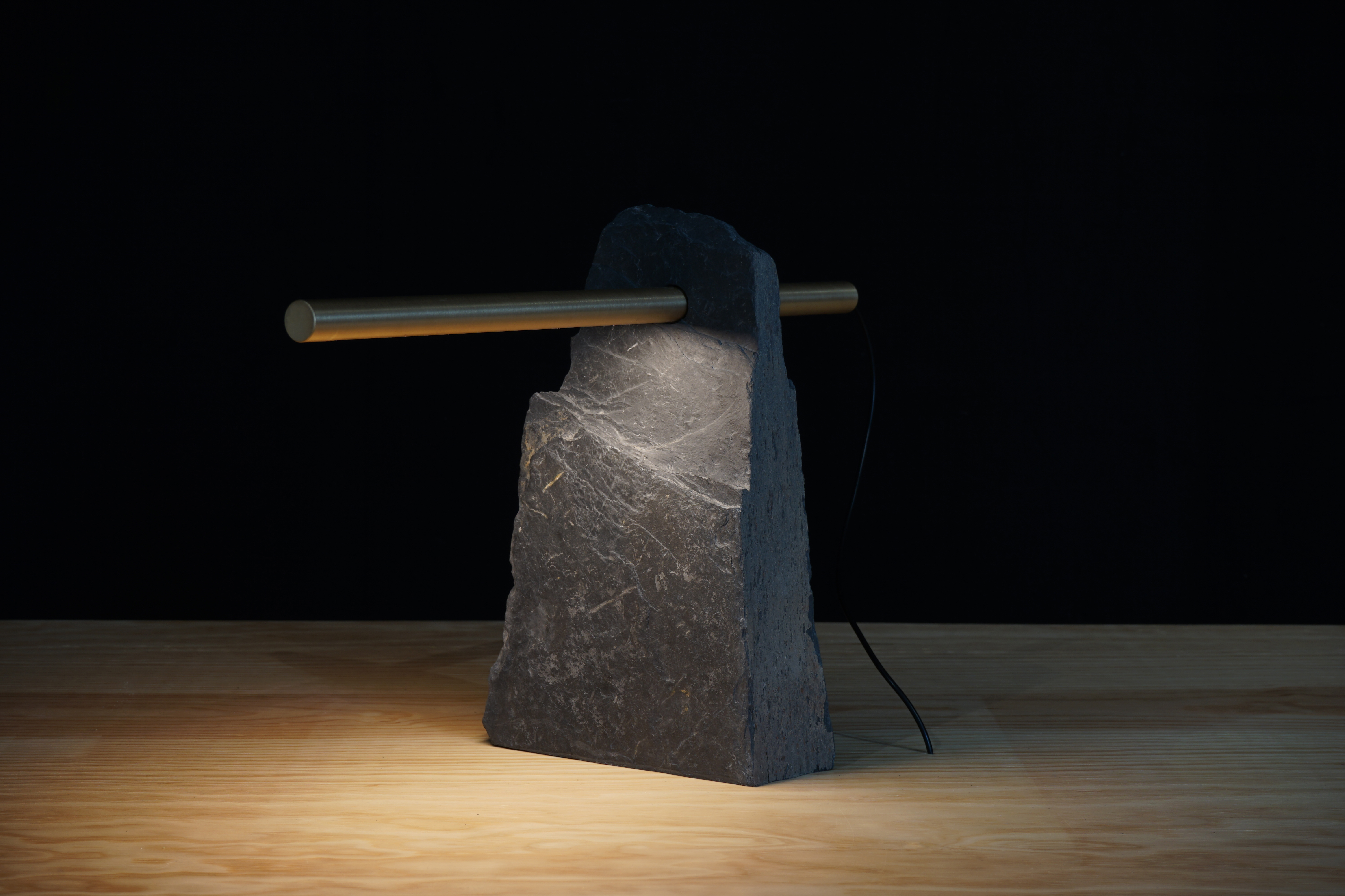
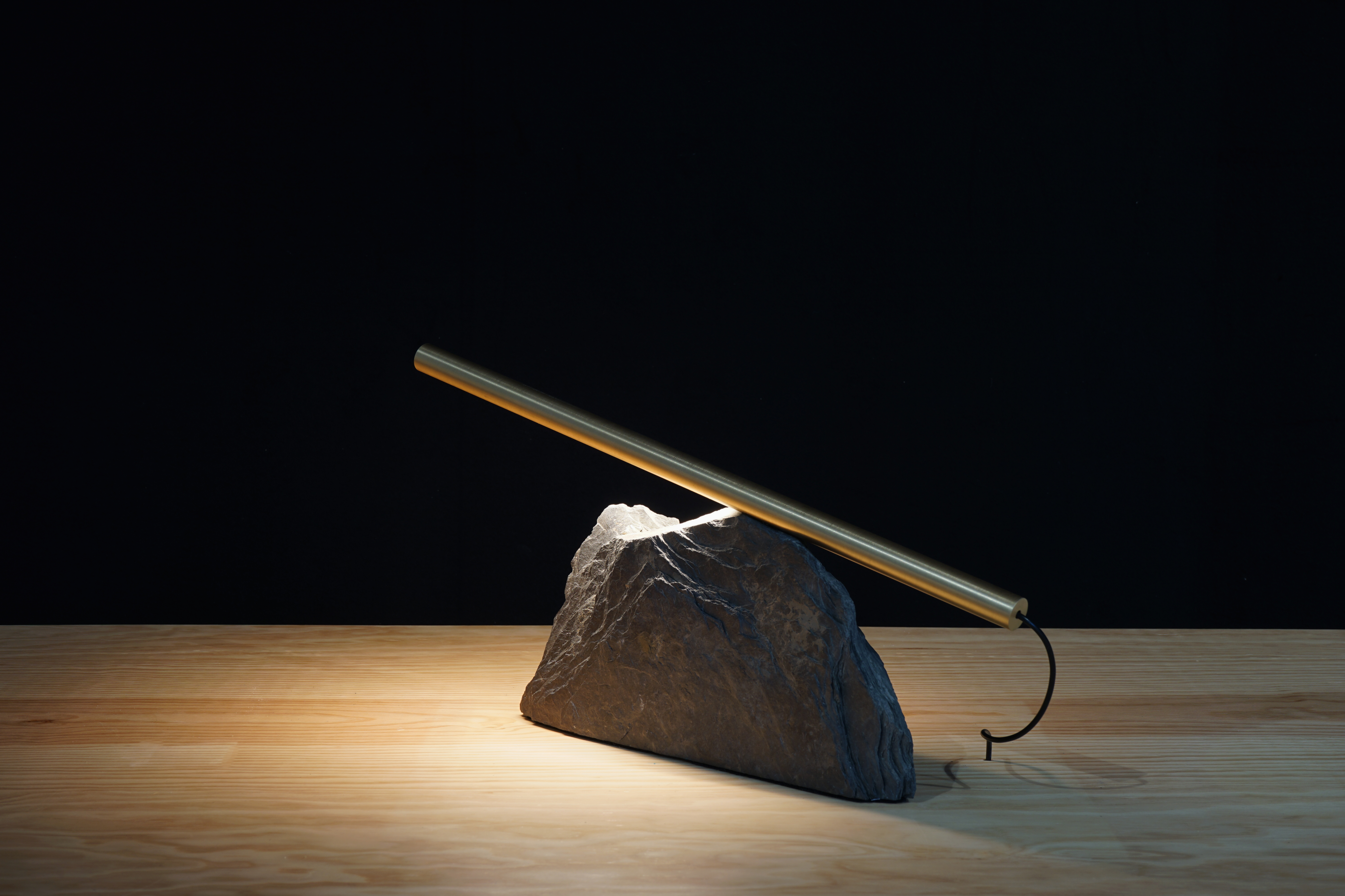
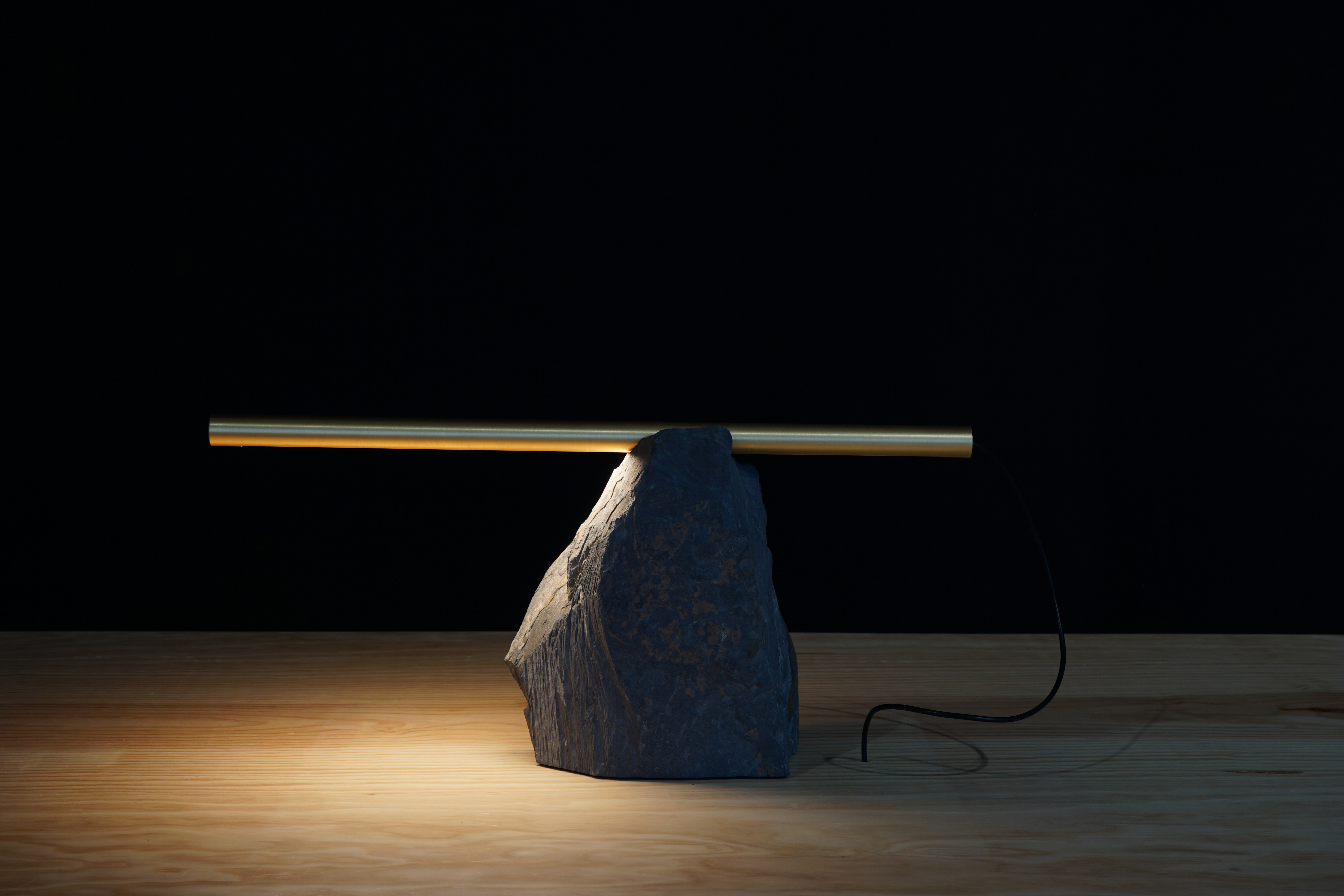
Slate stone & machined brass light ‘Richard’
New photos of my latest series of light objects, made from humble local slate stone and solid brass. The solid brass rods are precision machined and fitted with bespoke LED units. The slate stones are cut and sculpted individually – making every object different in shape and configuration. I like to think of it as a serial production of unique pieces.
The local slate stones have been sourced in a quarry on the border between Luxembourg and Belgium. The region and its architectural heritage has been shaped by this local stone. Often seen as a maybe not so noble material, I was determined to use slate in a new and contemporary way.
I called the edition ‘Richard’, as a cheeky nod to the work of Richard Long, who has often used slate rocks in his installations and who I always admired.
This research project has been financed with a grant from the Luxembourg Arts Council / kultur lx.


Halo
New lighting installation project at Rotondes made from 96 individually adressable low voltage LED RGBW light bulbs. Visually they appear to be classic E27 light fittings in a simple festoon configuration but they can be individually programmed to enable dynamic and interactive applications. The idea is to use the halo installation as a functional kit as well as a playful tool depending on the circumstances.
More info ( in french ): www.rotondes.lu/fr/notre-actu/la-rotonde-1-aureolee


Metalworks, designing & making
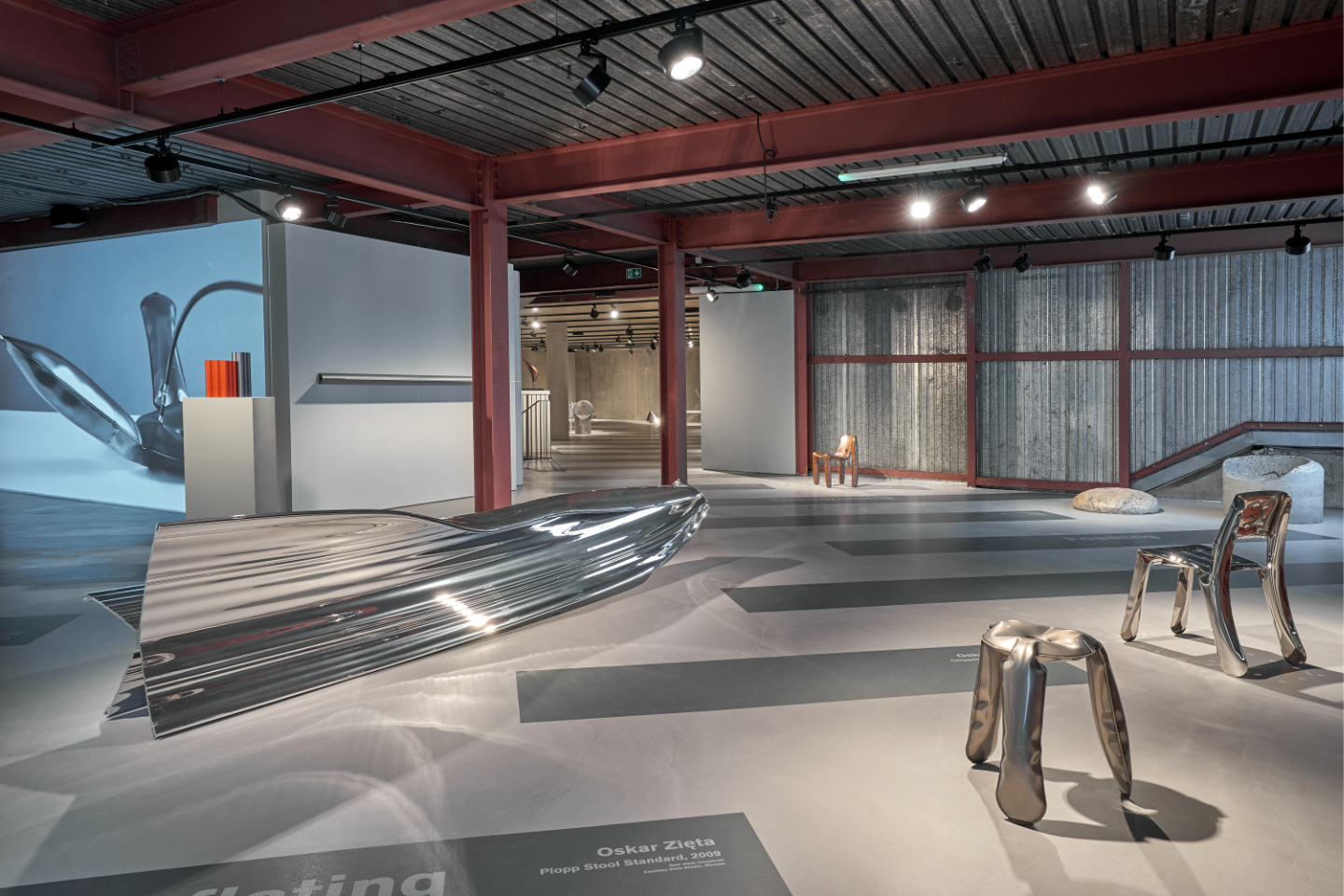


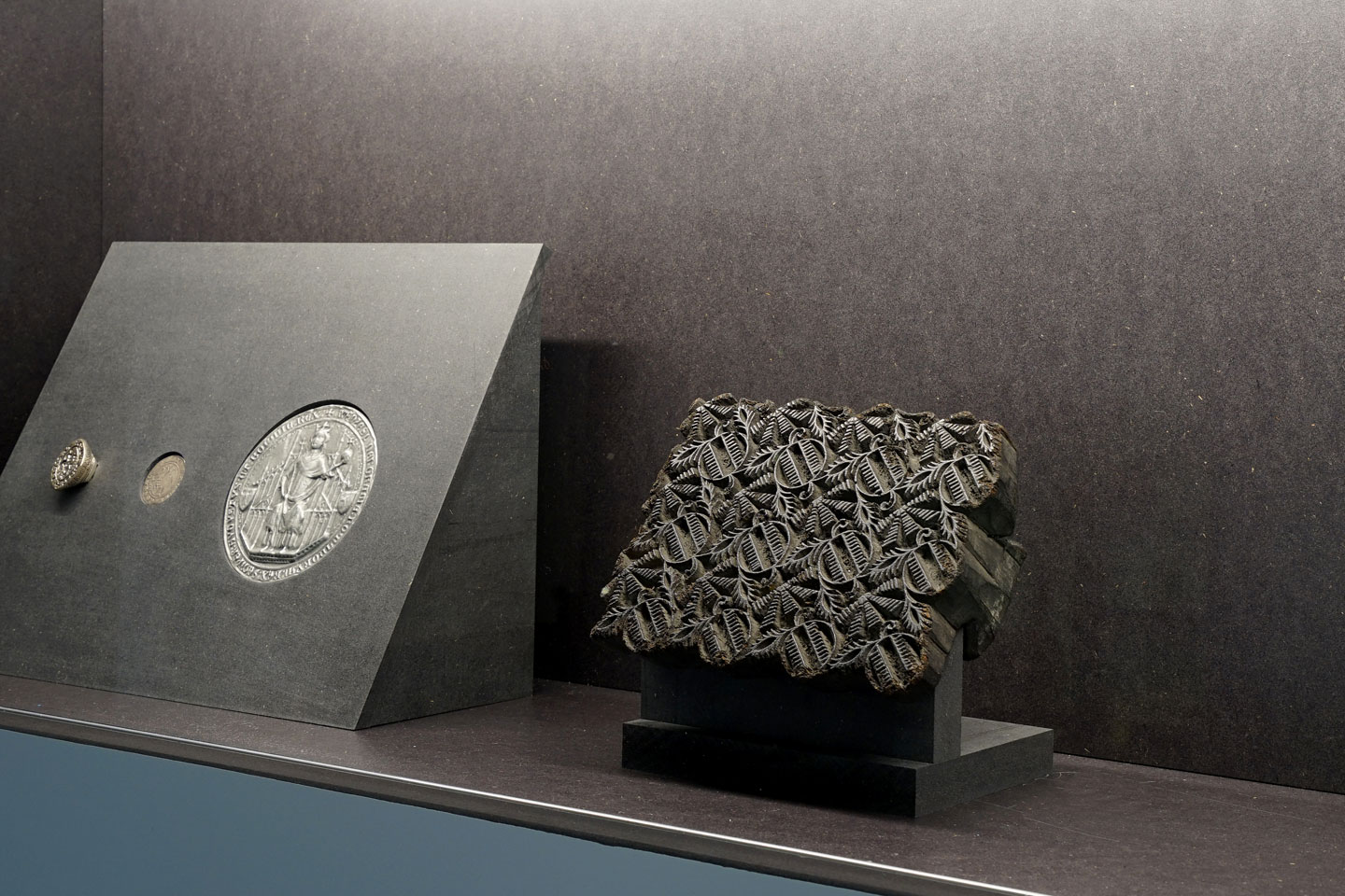
Within the framework of European Capital of Culture 2022, held in Esch-sur-Alzette (Luxembourg), I have curated and designed the exhibition ‘Metalworks, designing & making’ at the Konschthal in the city of Esch.
Esch was at the center of the European steel industry over the past hundred years or so and its heritage is shaped by the industry, offering an very poignant context to the exhibition subject.
For this project some forty contemporary design objects have been selected and divided into sixteen fabrication categories, each one of them exploring a particular method of processing metal.
Highlighting the diversity inherent to the material and the creative approaches, the different categories range from craft to high-tech. Each object has been carefully chosen for its intrinsic qualities and for its strong visual expression: They explicitly illustrate the manufacturing process by way of their form or finishing.
The exhibition illustrates how a material in combination with creativity and technical innovation lead to countless formal possibilities and encourage new exploration.
Participating designers:
Ron Arad, Ronan & Erwan Bouroullec, Destroyers/Builders, Christophe De la Fontaine ( Dante Goods and Bads), Tom Dixon, Konstantin Grcic, Thomas Heatherwick, Jakob Jørgensen, Xavier Lust, Sigve Knutson, Max Lamb, Joris Laarman Lab, Philippe Malouin, Muller van Severen, PELLE, Lewis Power, Maarten van Severen, Studio Swine, Jonas Trampedach, Danny Venlet, Michael Young, Oskar Zieta.
Additionally, the Konschthal has edited a book in conjunction with the exhibition, published by London based Sternberg Press and available here: sternberg-press.com/product/metalworks/
Curation, exhibition scenography & design: Georges Zigrand Design Consultancy
Co-curator: Charlotte Masse, Konschthal
Graphic design: Laurent Daubach / Designbureau
Signage & street furniture design
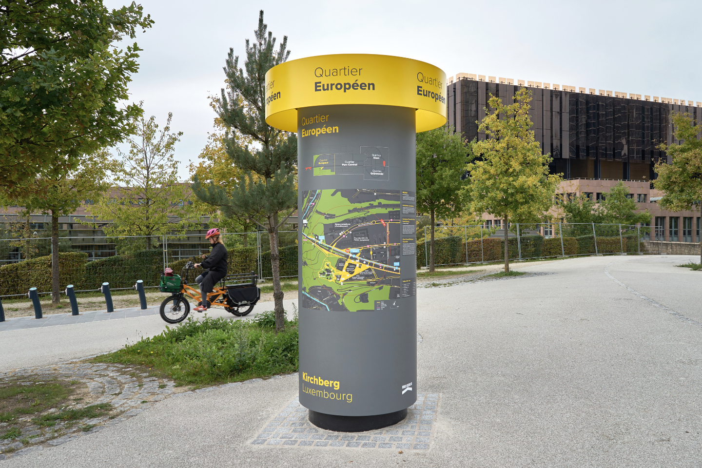
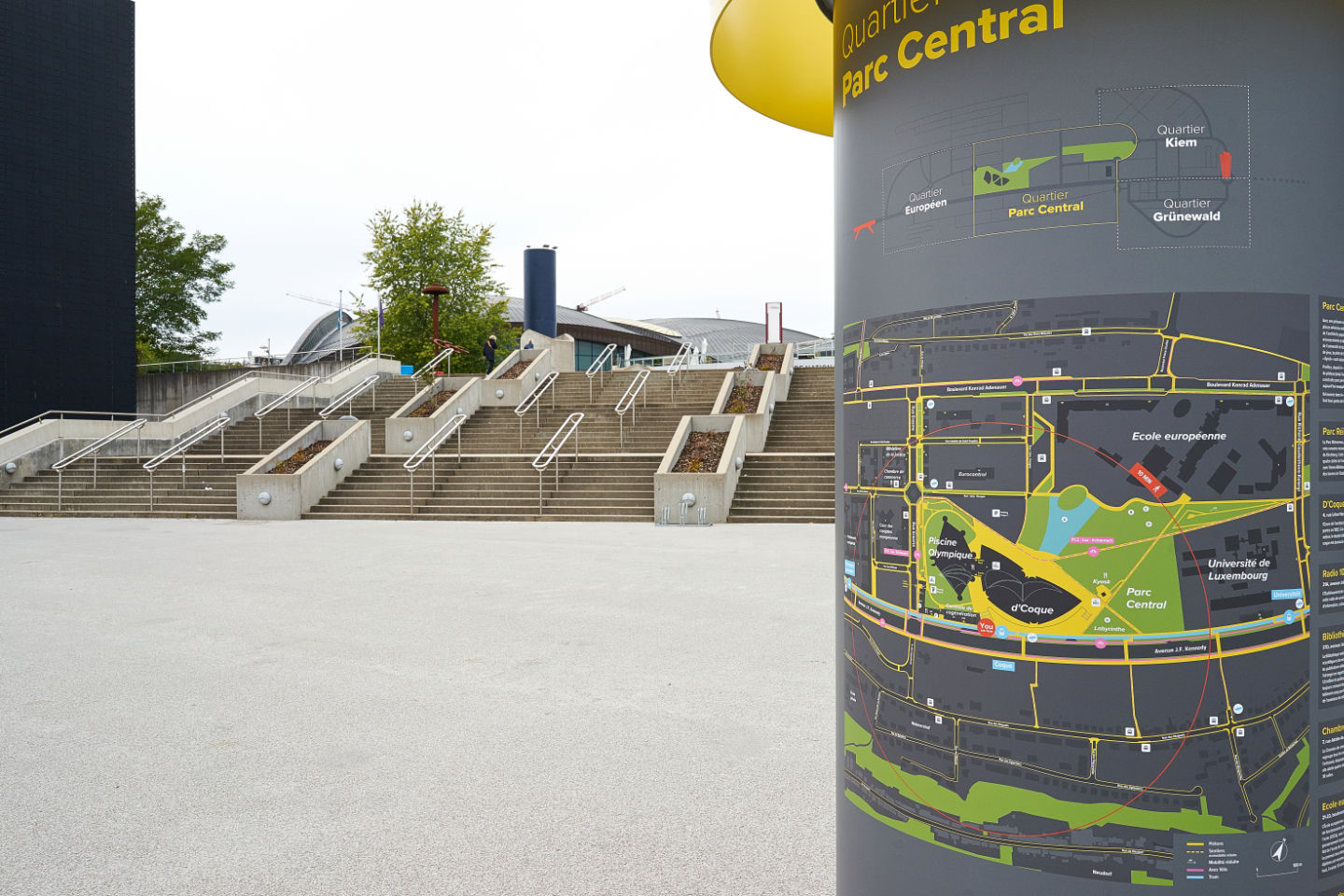


After developing a comprehensive urban signage and wayfinding concept for the Kirchberg area in Luxembourg-city, the scheme has now been implemented at all strategic locations & tram stations across the area.
The graphics, information and city map have been developed in compliance with stringent future accessibility guidelines and go way beyond the standards in terms of contrast and readability requirements.
The implementation and future changes of the map can be done independently by the client within their existing IT capabilities to ensure the high level of adaptations required for a fast changing urban area.
The overall concept consists of a system of bespoke designed elements, adapted to different urban scales and their context. The illustrated Morris column type street furniture is also bespoke and build in mostly untreated aluminium to enable the recycling of the raw material without additional treatments.
Client: Fonds Kirchberg, Luxembourg
Concept & design strategy: Georges Zigrand Design Consultancy
Graphic design: Laurent Daubach, Designbureau
Cast bronze signage


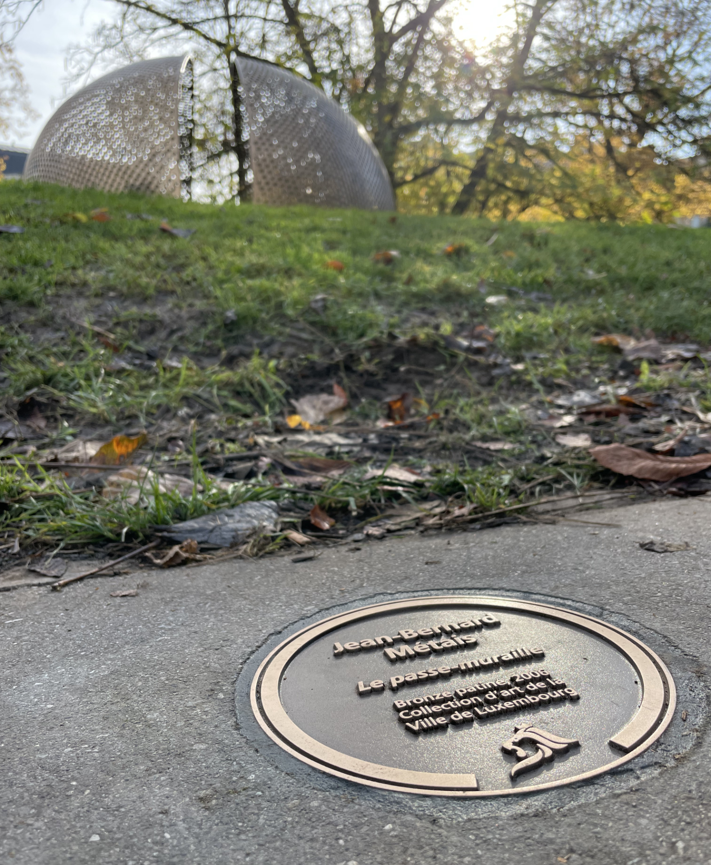

We have designed a new signage system to label the public space Art collection of the City of Luxembourg. The new system is based on a circular bronze cast that is mounted flush into the ground. The circular format allows for a much more flexible and non-aligned positioning in space, to fine-tune and orientate the information within pavings and to respond to often complex spatial environments. We wanted the signs to be visible enough for the urban stroller while not being too visible in the urban space. The Art collection being from different periods over the last 80 years our aim was also to make it look and feel like it has always been there, reflected in this traditional technique often used in public Art.
For the installation, only standard tools are required, using a common core drill with a standard width for fast and efficient implementation. Last but not least, the new signage is also reducing maintenance and de-cluttering the urban space.
Concept & product design: Georges Zigrand Design Consultancy
Graphics: Laurent Daubach / Designbureau
Client: Ville de Luxembourg, Coordination Culturelle
Castings: Fonderie Massard
mirror mirror, cultural reflections in fashion


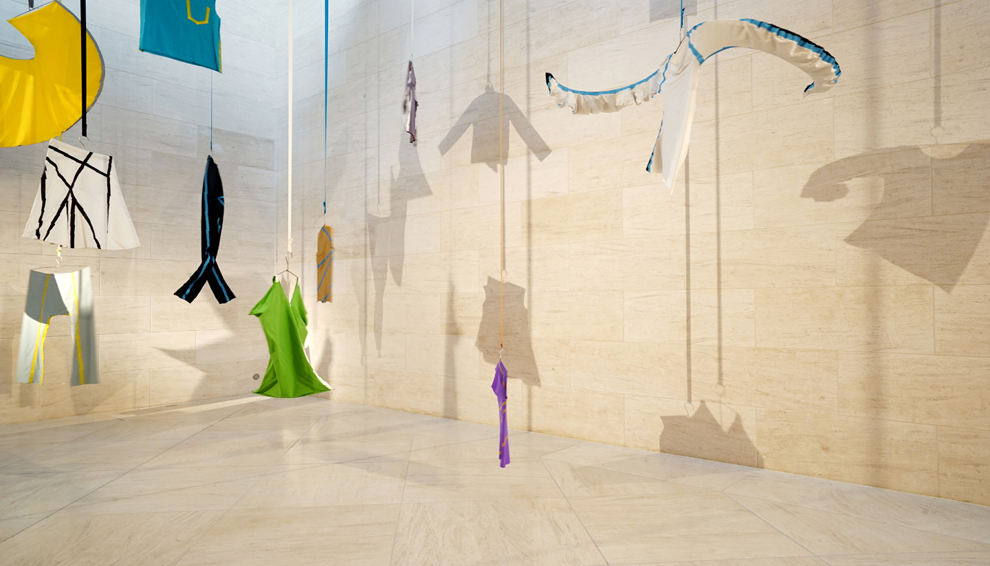
mirror mirror, cultural reflections in fashion is a temporary exhibition at Mudam, Contemporary Art Museum of Luxembourg. It is showing the in-house fashion design collection acquired over the last 25 years. Some truly visionary pieces that have become iconic for its time.
We designed this exhibition in a space never before been fully used for this purpose due to its architectural presence, challenging light and lack of possibilities to fix or hang anything. We hijacked some architectural elements and played with the space to connect and oppose the different works. The display follows a fluid path of crossovers and intersections, reflecting the hybrid nature of these pieces and creating a dialogue between them.
Artists:
Hussein Chalayan
Helmut Lang
Martin Margiela
Hiroaki Ohya
Grit and Jerszy Seymour
Walter Van Beirendonck
Junya Watanabe
Bernhard Willhelm
Exhibition dates: 30 Oct 2021 – 24 Apr 2022
Collection: Mudam
Curator: Sarah Zigrand
Scenography: Georges Zigrand
You are here

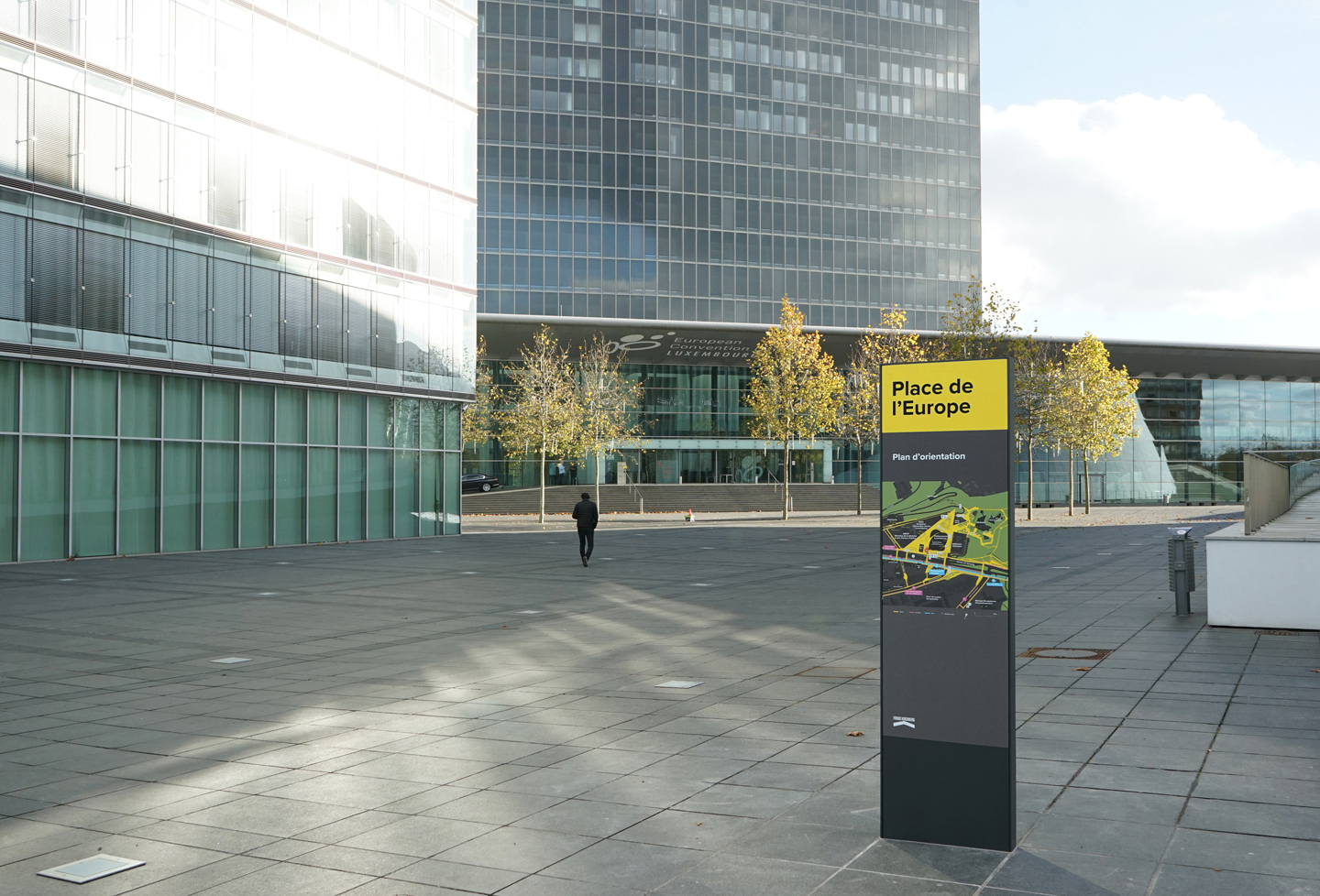
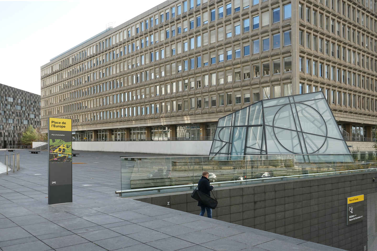

After developing a comprehensive wayfinding concept for the Kirchberg area in Luxembourg-city, and a prototype at the Central Parc, we have now rolled-out the first module of our system at the Place de l’Europe. The overall concept consists of a family of modules adapted to different urban scales and their context. The implementation of the signage system across the area is planned over the coming 12 months.
Graphics, text and city map have been developed in compliance with stringent future accessibility guidelines and go way beyond the standards in terms of contrast and readability requirements.
Any future changes of the map can be done independently by the client within their existing IT capabilities to ensure the high level of adaptations required for a fast changing urban area.
Client: Fonds Kirchberg
Concept & design strategy: Georges Zigrand Design Consultancy
Graphic design: Laurent Daubach, Designbureau
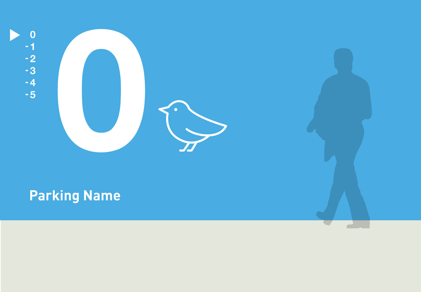
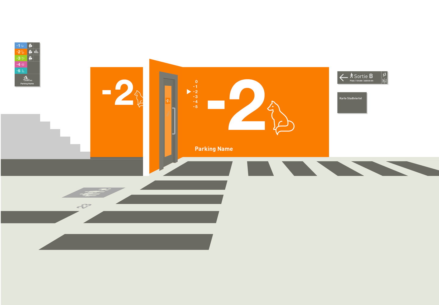
When car users become pedestrians again..
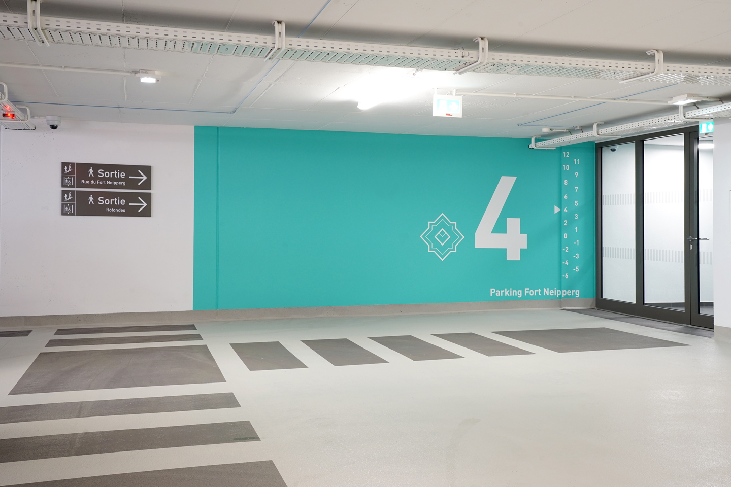


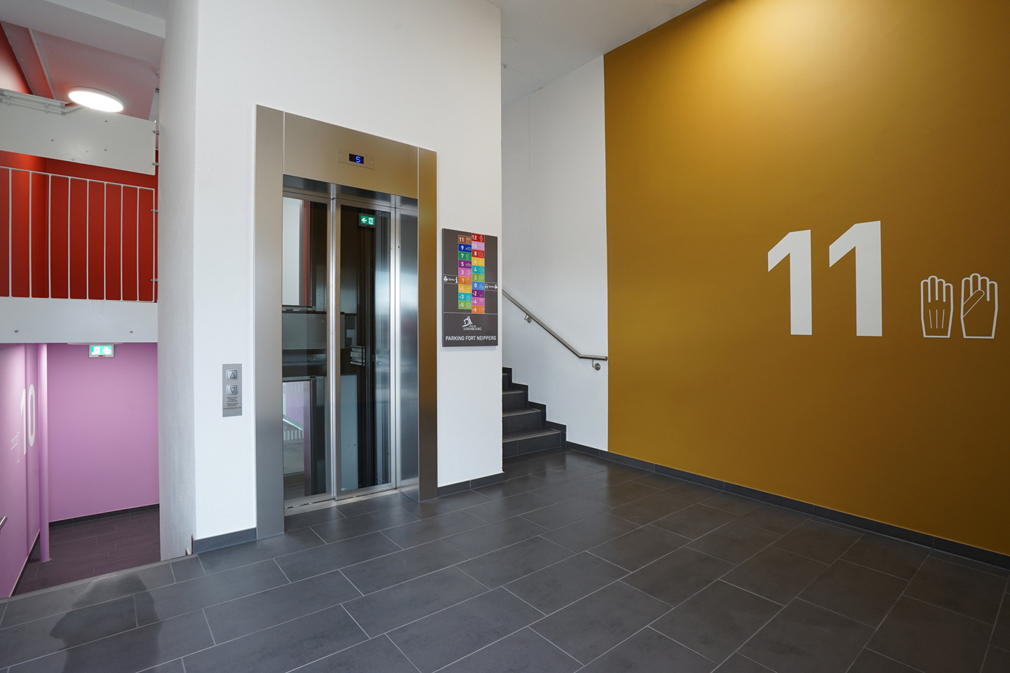
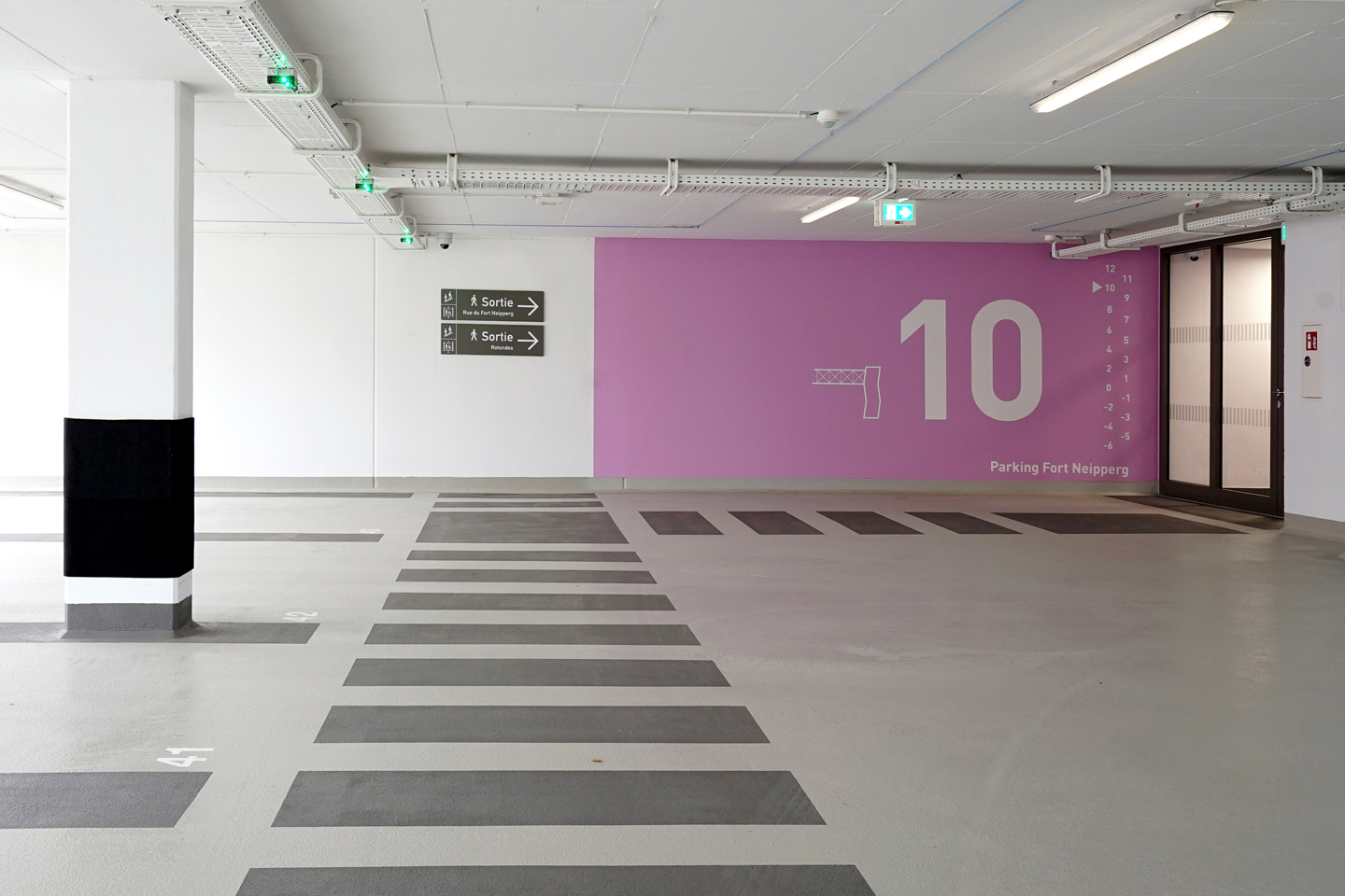
After developing a comprehensive new signage strategy & design manual for all the city of Luxembourg’s car parks (almost 20 different structures), Fort Neipperg, the first renovated car park has now opened to the public with our implemented design strategy.
Our user-focused approach has been to establish a clear hierarchy of the information and to prioritise on the more vulnerable, pedestrian user ( the driver / user outside the car). We separated the signage system for drivers & pedestrians for clarity and reduced the graphic interventions & colours to a strategic minimum to maximise their effectiveness. Our main aim was to make the perception of the space and the navigation within the space as intuitive as possible.
Floor level information consists of a range of carefully selected bright colours, in conjunction with illustrations and large scale numerals. They are only indicated on the exit stairs bloc, creating an intuitive ‘visual pull’ towards them.
Client: Ville de Luxembourg, Service Ouvrages d’Art, Génie Civil, Constructions
Concept & design strategy: WW+ Architektur & Georges Zigrand Design Consultancy
Graphic design: Laurent Daubach
Illustrations: Linda Bos
Twist & turn
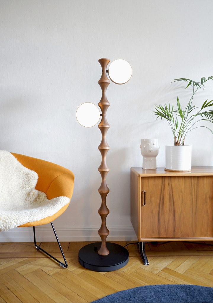
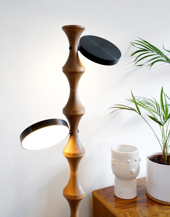
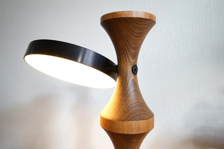

It started as a custom designed & developed LED standing light for the Chateau de Bourglinster, commissioned by the Ministry of Culture in Luxembourg. Now the project has developed into a series of products featuring dimmable and continuously rotating LED discs with bespoke electronics fitted to a CNC turned wooden stand.
Concept & design: Georges Zigrand Design Consultancy
Lighting engineering: integratedlight UK
Kulturhuef – Printing Museum, Gutenberg reloaded

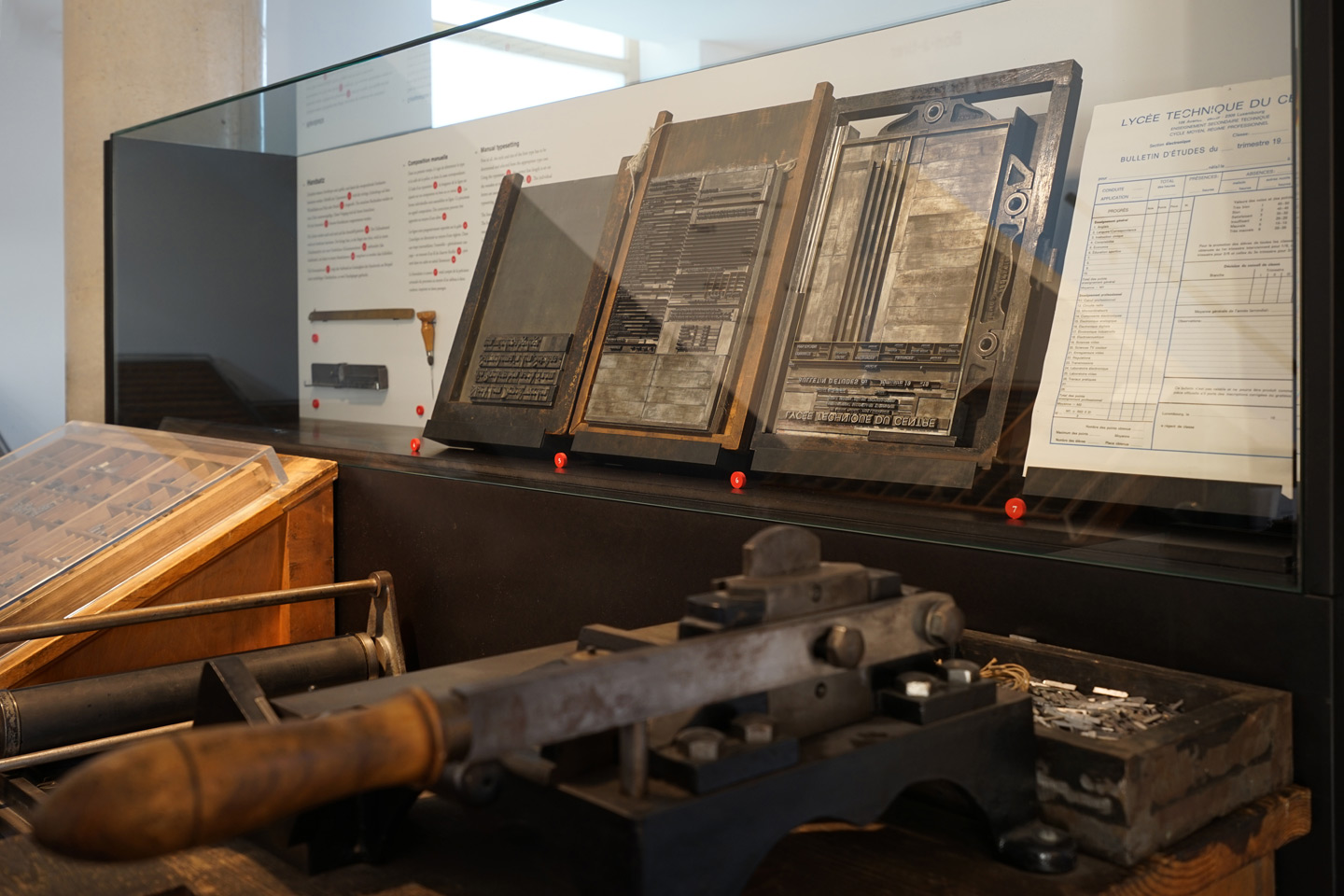
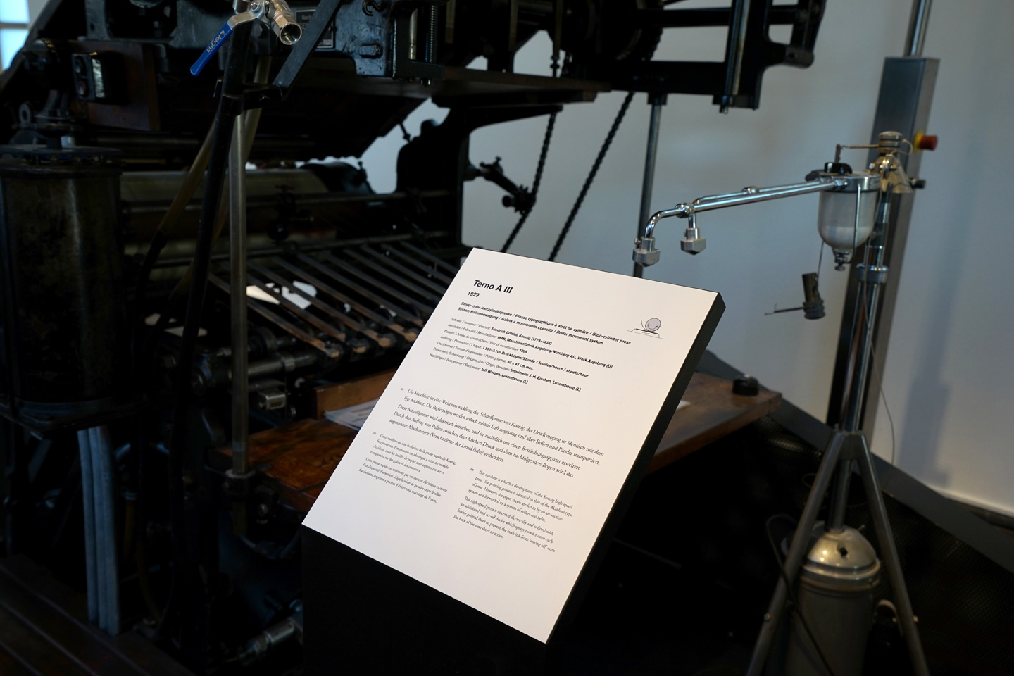


In collaboration with graphic designer Laurent Daubach we have designed a permanent exhibition about the history of printing for the Kulturhuef in Grevenmacher, Luxembourg. The pièce de résistance of the exhibition is a timeline with integrated showcases, spanning over the whole length of the main gallery. The timeline gives the visitor an educationally valuable overview of technical and related political changes from the beginnings of printing up to the 21st century.
Old meets new

In collaboration with the Service National des Sites et Monuments Nationaux we are re-designing the interiors of the Chateau de Bourglinster, on the outskirts of Luxembourg-city. Until the project is completed, here a little sneak preview showing a partial prototype test of a custom designed & developed LED standing light for the castle. The light will be dimmable and feature continuously rotating LED discs with bespoke electronics fitted to a CNC turned wooden stand.
Home sweet home
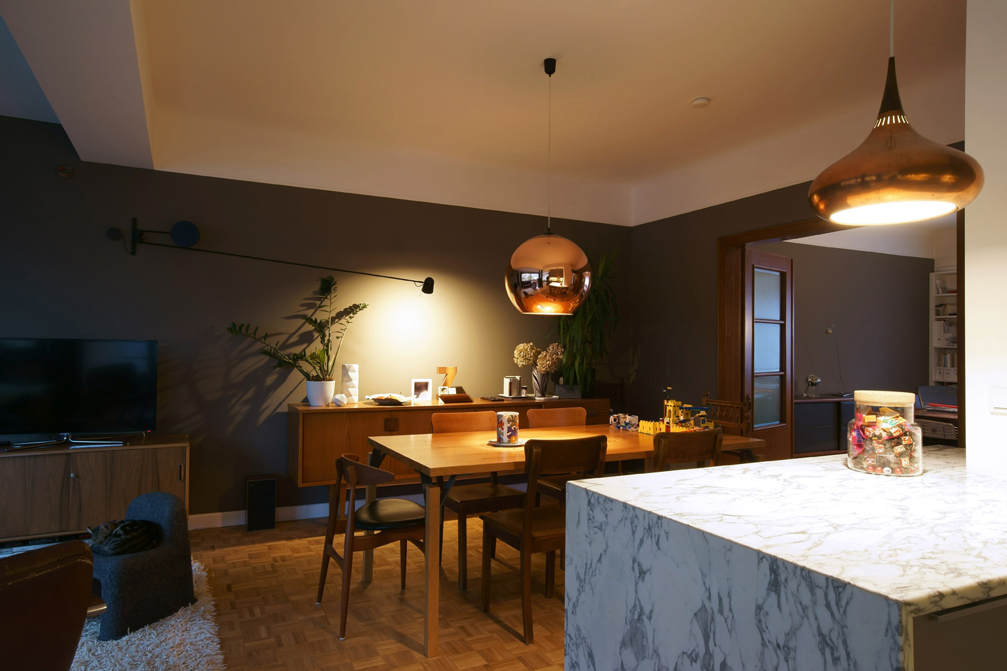

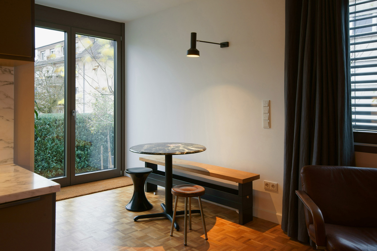
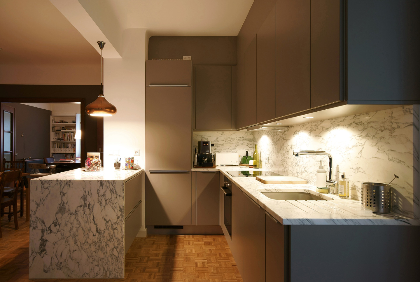
A recent interior design project, finding the right balance between old & new, vintage & contemporary design, in the quest of ageing gracefully…
Follow me

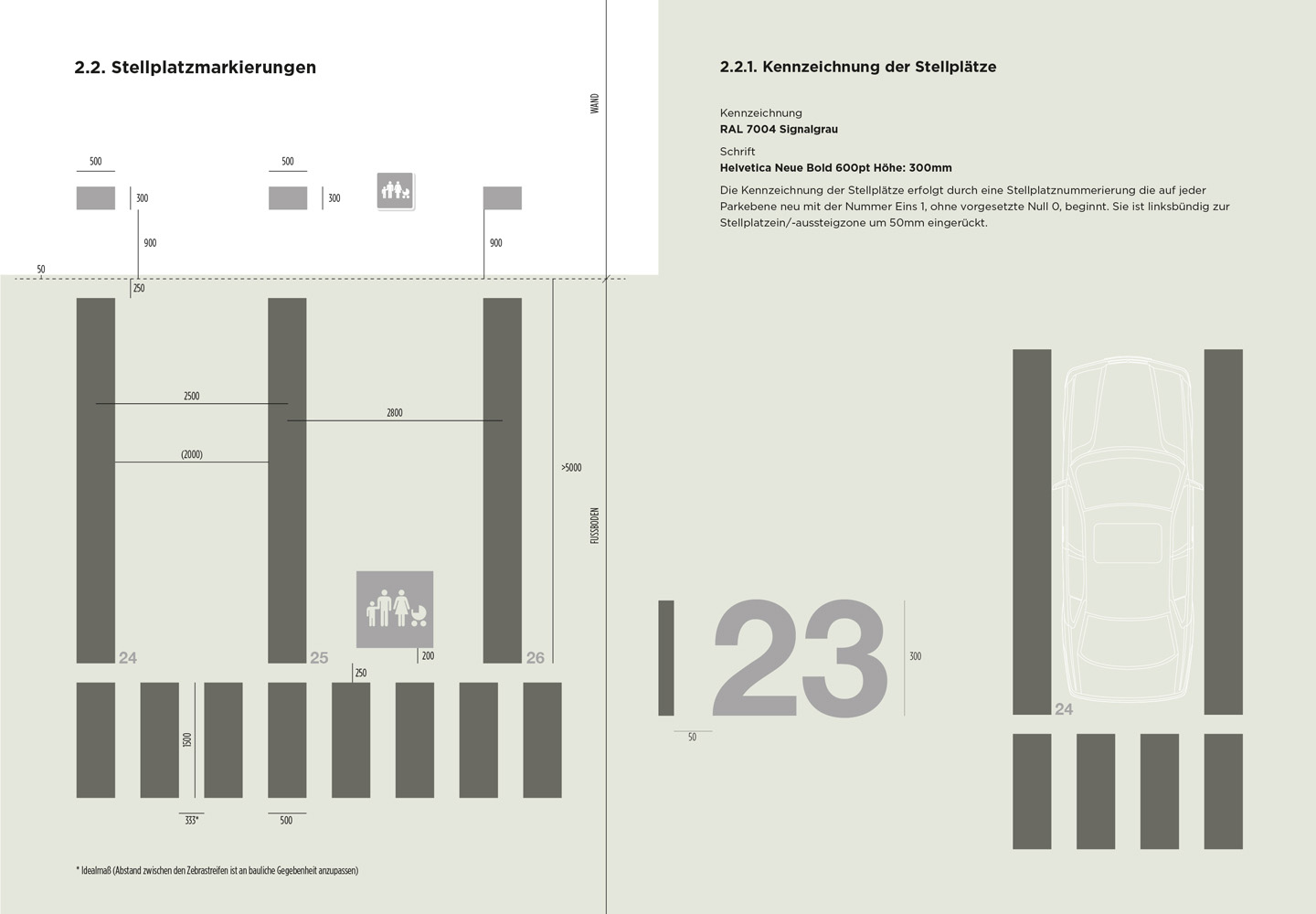
In collaboration with Luxembourg based architects WW+ we have been commissioned by the city of Luxembourg – Service Ouvrages d’Art, Génie Civil, Constructions – to develop a signage concept & design manual to implement a comprehensive new signage system across potentially 15 public parkings owned by the city ( starting with the parkings Knuedler & Neipperg). A challenging task considering that the buildings have very different layouts and circulation principles.
Our user-focused approach has been to establish a clear hierarchy of the information and to prioritise on the, more vulnerable, pedestrian user ( the driver / user outside the car). We separated the signage system for drivers & pedestrians for clarity and reduced the graphic interventions & colours to a strategic minimum to maximise their effectiveness. Our main aim was to make the spacial perception and the navigation within the space as intuitive as possible.
Floor level information consists of a range of carefully selected bright colours, in conjunction with illustrations and large scale numerals. They are only indicated on the exit stairs bloc, creating an intuitive ‘visual pull’ towards them.
Graphic design: Laurent Daubach
Wiedersehen macht Freude


My deckchairs, fitted with a custom designed fabric which shows all the colours of the 28 EU member state flags proportionally ( see post ‘Work hard, play hard’ ), have re-surfaced this summer in the old town of Luxembourg City. A year after the Luxembourg Presidency of the European Council they have been distributed to several city centre sites and used as public space furniture over the summer months.
Unfortunately we might have to take some classic blue, red & white out for next year.
Graphics: Laurent Daubach
Romain Urhausen – a journey through space & time


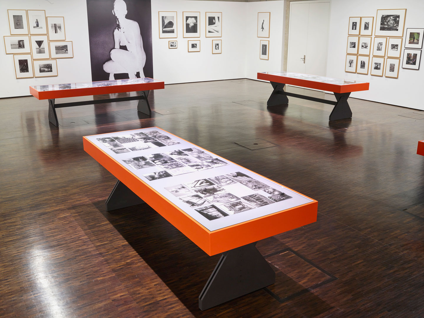
In collaboration with the curator Marguy Conzémius from the CNA (Centre national de l’audiovisuel) and the London based graphic designer Melanie Mues, we have designed a retrospective exhibition of the luxembourgish photographer Romain Urhausen.
Romain Urhausen, born in 1930, has accumulated such an enormous bulk of work over his lifetime that one of the challenges was to fit a maximum of artworks into a rather challengingly small space. Furthermore, we thought that photographs, sculptures, inventions & design objects from the 50’s up to the 90’s deserve an analogue rather then a digital display solution. The visitor therefore is invited to discover in a hands-on and interactive way, a large number of artworks from the artist’s journey through space & time.
ROMAIN URHAUSEN – FOTOGRAF exhibition at the CNA Display 01 & 02 in Dudelange, open until 30.10.2016
Curiosity Cabinet on tour


For the luxembourgish Presidency of the European Council from 01.07 – 31.12.2015 the Ministry of Culture commissioned me to design three spaces in the Justus Lipsius building of the Council of Europe in Brussels.
One part of the project consisted of this curiosity cabinet exhibition made from 45 individual front or back-lit boxes. The cabinet showed a more unusual side of luxembourgish history & culture, mixing together an apparent random selection of oddities and stories from past and present. One of the aims was to focus on the people (artists, writers, film makers, cooks, engineers & inventors) but also institutions, industries & customs that contribute to the fabric of the country, showing a side that would be little known outside its borders.
Following the Presidency the exhibition was recently shown at the Ministère de la Culture in Luxembourg. Currently the concept is being evaluated to be adapted to go on tour.
Back to the stone age


The national heritage agency in Luxembourg (Service des Sites et Monuments Nationaux ) has asked me to design & develop a bespoke information panel system for two distinct archeological sites. Both sites are unsupervised, which required a simple and robust solution against weathering effects and vandalism.
The steel support structures have been designed as light & unobstrusive as possible to integrate them visually into the sensitive archeological sites.
The information panels are manufactured in the northern Vosges region in France, famous for its glass manufacturing tradition. The panels are made from vitreous enamel in one of the only remaining vitreous enamel factories in Europe. This traditional technique, where the graphics are silkscreened on low carbon steel and fired at up to 850 C°, is extremly hard-wearing, UV stable and weathering proof.
Client: SSMN (Service des Sites et Monuments Nationaux)
En collaboration avec le CNRA (Centre National de Recherche Archéologique)
Graphic design: Arnaud Mouriamé
Work hard, play hard


The third installation of my project for the Luxembourg Presidency of the European Council 2015 in the Atrium of the Justus Lipsius building in Brussels.
The idea of sitting together in a more sociable and friendly way, as one does between friends that work on a common project, is also the idea behind the installation in the Atrium of the Justus Lipsius building (see previous post ‘Presidency of the European Council design project – part 2’ ). The visitors are invited to claim the space and to move the deckchairs around by reconfiguring them as they wish.
The 28 deckchairs bring together in a proportionate yet abstract manner all the colours of the flags of the 28 Member States – by collecting & rejigging these colours into a new composition which was then printed onto the fabric in a ‘traditional stripey way’. Everybody will be able to find their ‘own’ specific colours within a collectif colour scheme.
The deckchairs also refer to the poetic image of time spent with family and friends, which for many Luxembourgers, means past holidays spent at the Belgian coast – a nod also to Belgium, the country with which Luxembourg has close links, and which houses the Council.
Client: Ministère de la Culture
Graphic artwork: Laurent Daubach
Presidency of the European Council design project – part 2


The Presidency campfire meeting room, for the Luxembourg presidency of the European Council
By analysing the usually conventional set-up of meeting rooms for diplomats & heads of state one thing becomes clear, there is always a certain distance between the individual seatings – not too close and yet not too far away from your interlocutor. On this occasion I was able to challenge this status quo by creating a space where everybody had to decide for himself how close he or she wants to sit in relation to their interlocutor (and how good a friend he or she really is).
The ‘campfire’ is a space for people that share a common project & a common cause. A place where you can sit all night talking to friends, sorting out differences and coming out with a stronger bond… even if that looks like a difficult thing to achieve at this moment in time.

leave a comment