The future has landed, a long time ago

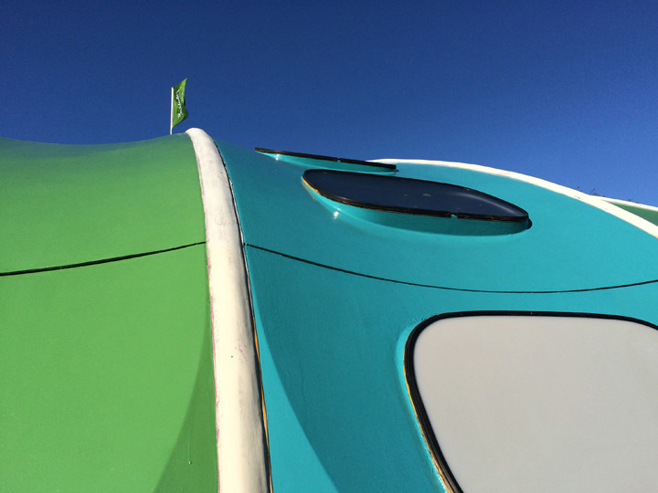

A beautiful 70’s swimming pool on a camping site in Larochette, Luxembourg. The cherry on top of the cake: Half the building rotates and slides open in good weather.
Vintage on a different scale!
Matching graphics
 “Your penny is worth more at the Cooperative supermarket” is a great slogan, and the graphics on these match boxes are even better. Not sure from which period this is ( I would guess late 70’s early 80’s), but I wish retail graphic design would more often be this convincingly simple, minimal, bold & confident (even if it looks a bit communist).
Beads & buttons fun

I saw this ingenious way of displaying buttons in a Madrid shop. The big wheely device looks more like something from a fun fair and turns at will in order to best view all the buttons on display.
This principle could also be used in many other contexts like interpretative devices in museums …etc. And of course as a way of visually displaying information on the i-phone…
Hokus Pokus
Here another fine example of a vintage kids furniture piece I recently bought. Named Hokus Pokus, this multifunctional furniture was manufactured in Sweden by AB Bjärnum Möbelfabriker. All in one, it is a high chair that becomes a rocking chair with steering wheel or a desk with seat, depending on how you flip it around. Every aspect and form has a purely functional ‘raison d’être’ which gives the object its visual complexity and its overall shape. This uncompromising and honest approach linking form and function makes this unusual object in my view very interesting.
First work bench
I found this versatile piece of kids furniture in a vintage shop. It consists of a bench, desk with seat and storage facility. Convincingly basic and low-tech its shape results purely from the functions it serves. Manufactured by a brazilian company called Estrela.
Great legs
I found these stools in the bar of the India Club at the Continental Strand Hotel in London. What a great, simple, dynamic yet functional way to design legs for a piece of furniture that is usually very uneventful.


leave a comment