Old meets new

Paul Smith shop in Albemarle Street, central London designed by 6a architects
A fantastic example on how to integrate a contemporary shop front design into a heritage environment, without resorting to pastiche. The intricacy of the contemporary cast iron panels & railings marries the texture of the old facade, making both old and new stand out.
Look at me, look at me
A bit of fluorescent tape and you’ve got attention, even if you have been around for hundreds of years.

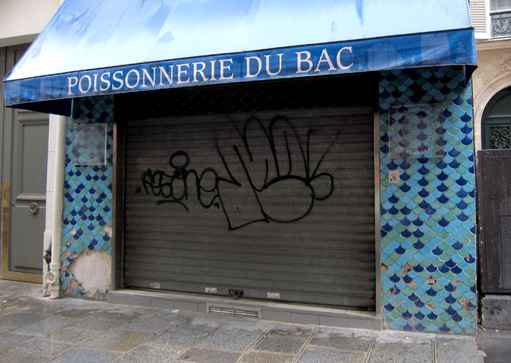
The right type of scale

Paris bashing
It is well known that the bistro culture in Paris is a league on its own, sitting tightly packed on street corners, coffee & cigarettes, waiters that don’t care, gazing at the people passing by …
The typical Paris bistro table with a single foot and an oversized thin metal edging embodies this way of life quite well for me. Every bash and knock the metal edging gets adds character & texture to the table, making it age gracefully without aspiring to be perfect.

Matching graphics
 “Your penny is worth more at the Cooperative supermarket” is a great slogan, and the graphics on these match boxes are even better. Not sure from which period this is ( I would guess late 70’s early 80’s), but I wish retail graphic design would more often be this convincingly simple, minimal, bold & confident (even if it looks a bit communist).
Cheap & cheerful

Creating a street stall for a one day event to sell hand made scarves from Bangladesh is not my usual design brief, especially if the budget had to be kept at an absolute minimum. But there is always a way, even if it means going to the DIY shop..
Scarves designed by Luxembourgish designer Anne-Marie Herckes with the assistance of the Vocational Training and Employment Generation Project of the NGO ‘Friendship’.
Quality banking

Interior concept for the 74 branches of the Banque et Caisse d’Epargne de l’Etat, a national institution in Luxembourg – designed by Teisen-Giesler Architectes & Georges Zigrand Design Consultancy
We elaborated a scheme conveying the notion of safety, tradition, quality and long established values. By emphasising solid build elements made from cast terrazzo and oak we underlined the trustworthy image of the bank. Timeless shapes and high quality materials should also underline the fact that the bank, with it’s long history, is here to stay.
The design proposal were elaborated following an closed competition initiated by the BCEE.
Beads & buttons fun

I saw this ingenious way of displaying buttons in a Madrid shop. The big wheely device looks more like something from a fun fair and turns at will in order to best view all the buttons on display.
This principle could also be used in many other contexts like interpretative devices in museums …etc. And of course as a way of visually displaying information on the i-phone…
Chez Jeannette

The more you can do with LED technology the keener I get of the old fashioned neon sign aesthetics. I saw this great neon sign in Paris above the bar of the Café Jeannette, rue du faubourg Saint Denis. I very much like the way it extends into an architectural feature delineating the space of the bar and not limiting itself to just be a sign.
It also made me think of the great Kraftwerk song ‘Neon Lights’:
Shimmering neon lights
And at the fall of night
This city’s made of light…

leave a comment