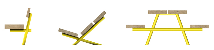
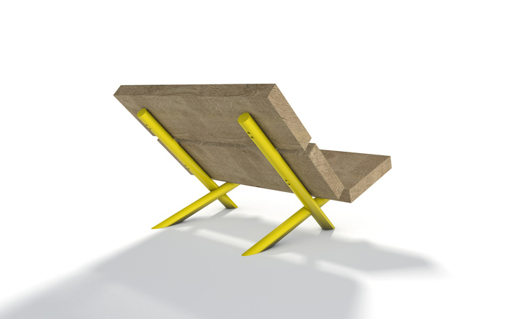
Outdoor furniture – extra bold
Designed for outdoor spaces like nature reserves, parks & forests, this seating range is composed of large & chunky shapes with very simple profiles. The large – single piece – wood parts are made from locally sourced oak trunks with a simply sawn finish to resist weathering and vandalism. Due to its thickness, the wood can be sanded down if damaged but can also happily live with the added texture.
The wood profiles and tubular powder coated steel tubes are both an integral part of the structure and form objects with a strong visual contrast between natural and man made materials. The simple & sculptural shapes should integrate well in natural environments, yet stand out enough to be noticed for its quality.


Have a seat and enjoy
The City of Luxembourg commissioned us to develop an furniture and colour guidance manual for the terrasses on one of it’s most prestigious squares in the city centre. After many years of wild west behavior of the restaurants and cafés, using mostly cheap looking plastic furniture, branded umbrellas, primary colours and endless clutter the city wanted to clean up.
The new scheme, involving a selection of muted colours and more attractive furniture typologies has now been implemented, giving the square a more dignified and calm appearance while focusing on the quality of the space, the trees and the architecture.
One of press critics wrote at the time that we want to take colour and life out of the City, thankfully the chap in his all red training outfit plus hat has turned-up on my photo (on the right) to prove that it is not furniture & umbrellas that are creating a colourful city life!


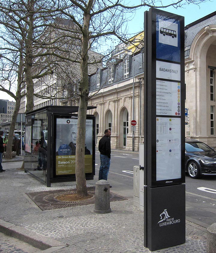
A new bus shelter for Luxembourg-city
Based on an existing JCD shelter designed by Norman Foster we fine-tuned & adapted the design in collaboration with the city and JCD to better fit todays user needs. Over 250 shelters will be installed / replaced the next couple of years across the city’s bus network.
With a user-centered approach the team developed a new back-lit independent totem that regroups a number of information that is easy to read, even from a distance. The same logic applies to the glass panel on the opposite side where we also re-grouped passenger information usually spread randomly all over the shelter.
Eau de Luxembourg

This water drinking fountain is the first of many to be installed in the City of Luxembourg. The scheme was initiated by the city’s own Service des Eaux and elaborated in close collaboration with the City Management, other administrations of the city and myself as an external design consultant.
After an in-depth research of existing drinking fountains across Europe we have identified this fountain as the most suitable product for Luxembourg. The fountain has initially been developed by the french designer Cécile Planchais for Eau de Paris and will also be rolled-out in Paris next year.
Besides the functional & hygienic qualities its subtle timeless design has convinced us to be the right choice for Luxembourg. The textured surface and distinctive shape blurs the boundaries of time, making it contemporary but also fit nicely in an heritage environment. Also, after two days in use in the city the form and shape has proven that its function and purpose is self-explanatory.
Manufacturing pride

While driving through the Burgundy region in France I came across this beautiful old factory building in the small town of Génelard.
I really liked the confident, almost out of scale, presence of the signage on the building. On top of that the signage is not an after-thought but completely integrated into the architecture. Compared to many of today’s undistinguished manufacturing halls it also tells the story of an admirable industrial pride.
Back to nature
 I have seen this type of benches before in forests and parks without really appreciating them. But the concept of a bench with a cast structure that mimics root wood, as disturbing as it looks, starts to grow on me. If you choose casting as a technique you can also open up to other shape typologies, no reason to keep the geometric language you pretty much have to respect if you fabricate something in any other standard way.
To then paint it in such a colour makes the bench almost eccentric, even if it goes against the initial idea of making the bench blend into its natural surroundings.
I also wondered if Maarten Baas came here on holiday one day…
Decluttering
Each day our cities seem to get more cluttered with new types of street furniture and equipment that didn’t exist only a few years ago. These new elements include endless amounts of operational electrical and telecommunication boxes that sprung up as these providers have been privatised and now operate without coordination. Additionally we also see an increase in free magazines dispensers, wi-fi masts, bike hire schemes, advertising and signage …etc that are implemented by different operators. Finally, the first digital advertising screens for city centers are threatening to be creeping-up in a city near you.
This creates a messy cocktail of visual pollution that damages the perception of our cities and we think it is important that cities have an organised and coordinated approach of how to handle the visual implications to our shared public space. The level of clutter should be contained and kept to the required minimum but, as many amenities remain necessary, there is also scope to regroup these into clusters and find new solutions of how they can be brought together or integrated into existing elements.
We have produced some first thoughts on this topic based on a specific urban context but to find a holistic approach requires an in depth consultation between all stakeholders (city officials, road engineers, private companies, urban planners and designers) to work out a strategy that is easy to apply to different urban situations without costing over the odds. In some situations this would result in new designs but the overall aim should be to regroup existing elements or to find inventive solutions that don’t require new structures.

- Urban amenities cluster
Picnic in Armenia
A friend of mine sent me this amazing picture of a picnic area in the woods near lake Sevan in Armenia. The first reflex of a local authority would be to paint these structures in a camouflage green / grey to blend in. I find this choice of colour stunning and beautiful, the contrast of the cyan blue in the wood highlights both nature and man-made structures, producing a surreal fairytale ambiance.
 Photo © Sandrine Scheller
Canary Wharf map texture
Applying a texture to the surface of street furniture is not only enhancing the visual quality (by adding intricacy, light and shadow), it also helps damages and scratches to ‘disappear’ and makes fly-posting very difficult. This need for texture in street furniture is usually solved by applying a straightforward pattern with no particular meaning or context but in this great example of a lamp post from Canary Wharf in London, the designers have used a simplified map of the very area where they are implemented as the basis of the pattern.

- Street furniture texture
Flower power
To counter the slightly grim baskets of geraniums in our towncenters the City of Luxembourg has asked Georges Zigrand Design Consultancy to come up with some ideas of how to bring flowers to their city in an alternative way and without adding clutter at ground level. Using the existing lamp post, just like the traditional baskets, this proposal would see rings of flowers and grasses creating a much larger floral area hovering above street level.

Designed by integratedplace © 2010
Schiphol airport signage
It doesn’t take much and you would miss your plane if you wouldn’t have this information. Even so, it is amazing to see how many airports don’t include the required walking time to get to the gate.

Making our cities more child friendly
Brussels pedestrian crossing. Another example of the low budget yet convincing Belgian way.


leave a comment