Halo
New lighting installation project at Rotondes made from 96 individually adressable low voltage LED RGBW light bulbs. Visually they appear to be classic E27 light fittings in a simple festoon configuration but they can be individually programmed to enable dynamic and interactive applications. The idea is to use the halo installation as a functional kit as well as a playful tool depending on the circumstances.
More info ( in french ): www.rotondes.lu/fr/notre-actu/la-rotonde-1-aureolee


Cast bronze signage
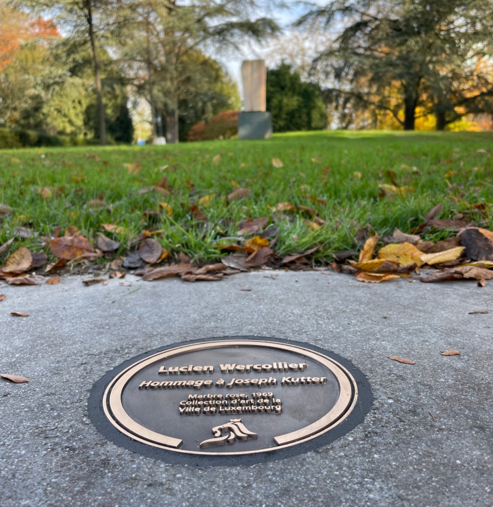


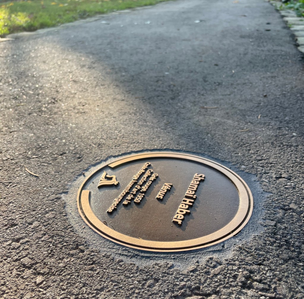
We have designed a new signage system to label the public space Art collection of the City of Luxembourg. The new system is based on a circular bronze cast that is mounted flush into the ground. The circular format allows for a much more flexible and non-aligned positioning in space, to fine-tune and orientate the information within pavings and to respond to often complex spatial environments. We wanted the signs to be visible enough for the urban stroller while not being too visible in the urban space. The Art collection being from different periods over the last 80 years our aim was also to make it look and feel like it has always been there, reflected in this traditional technique often used in public Art.
For the installation, only standard tools are required, using a common core drill with a standard width for fast and efficient implementation. Last but not least, the new signage is also reducing maintenance and de-cluttering the urban space.
Concept & product design: Georges Zigrand Design Consultancy
Graphics: Laurent Daubach / Designbureau
Client: Ville de Luxembourg, Coordination Culturelle
Castings: Fonderie Massard
Follow me
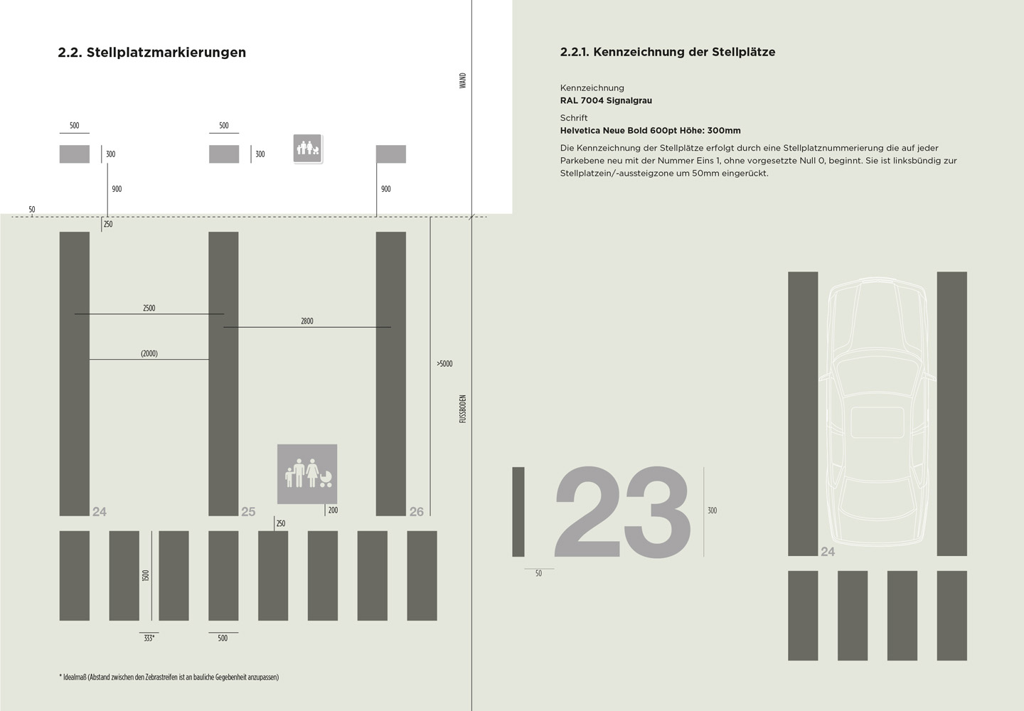
In collaboration with Luxembourg based architects WW+ we have been commissioned by the city of Luxembourg – Service Ouvrages d’Art, Génie Civil, Constructions – to develop a signage concept & design manual to implement a comprehensive new signage system across potentially 15 public parkings owned by the city ( starting with the parkings Knuedler & Neipperg). A challenging task considering that the buildings have very different layouts and circulation principles.
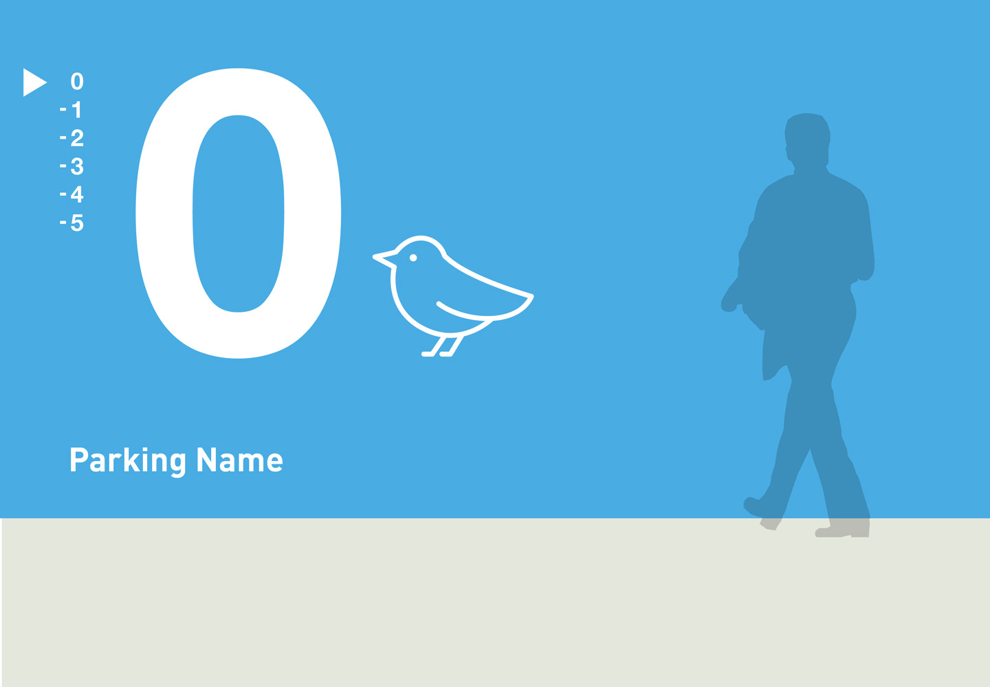
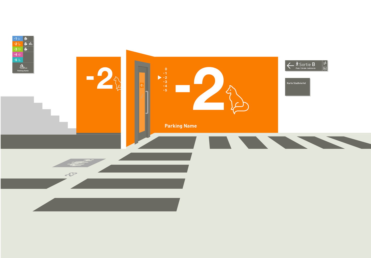
Our user-focused approach has been to establish a clear hierarchy of the information and to prioritise on the, more vulnerable, pedestrian user ( the driver / user outside the car). We separated the signage system for drivers & pedestrians for clarity and reduced the graphic interventions & colours to a strategic minimum to maximise their effectiveness. Our main aim was to make the spacial perception and the navigation within the space as intuitive as possible.
Floor level information consists of a range of carefully selected bright colours, in conjunction with illustrations and large scale numerals. They are only indicated on the exit stairs bloc, creating an intuitive ‘visual pull’ towards them.
Graphic design: Laurent Daubach
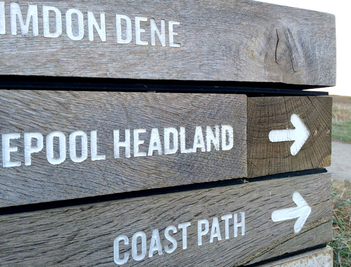
Hartlepool shows the way
Very robust and beautifully simple coastal path signage between Hartlepool Headland and Crimdon Dene, North East England
Fair games
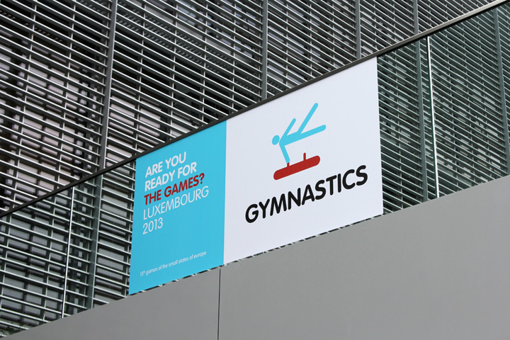
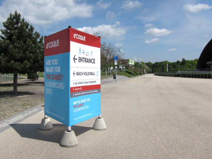
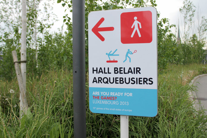
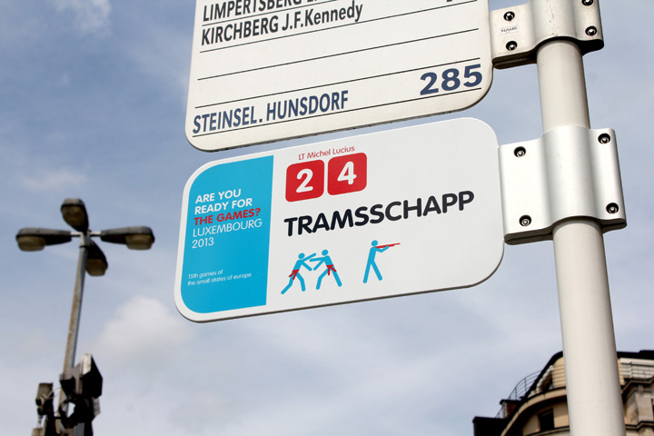
Just finished a signage & wayfinding project for the Olympic Games of the Small Nations of Europe, held in Luxembourg this year. Very refreshing to work on a fast and short term project for a change. In collaboration with Luxembourg based Designbureau. Client: Comité Olympique et Sportif Luxembourgeois
Pondicherry shows the way
Manufacturing pride
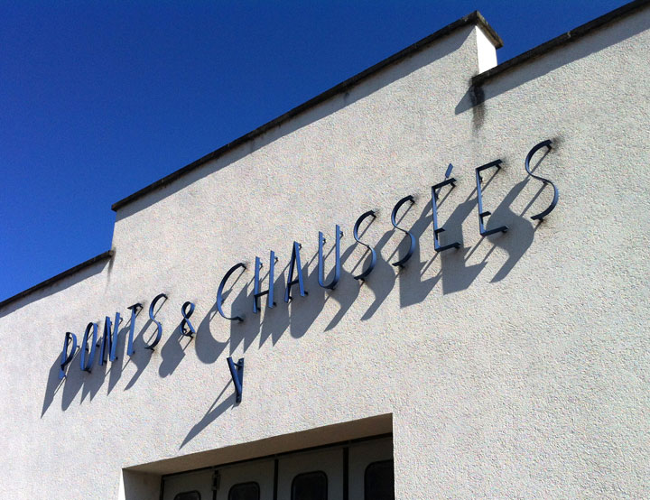
While driving through the Burgundy region in France I came across this beautiful old factory building in the small town of Génelard.
I really liked the confident, almost out of scale, presence of the signage on the building. On top of that the signage is not an after-thought but completely integrated into the architecture. Compared to many of today’s undistinguished manufacturing halls it also tells the story of an admirable industrial pride.
Chez Jeannette
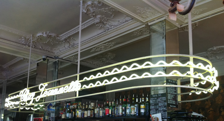
The more you can do with LED technology the keener I get of the old fashioned neon sign aesthetics. I saw this great neon sign in Paris above the bar of the Café Jeannette, rue du faubourg Saint Denis. I very much like the way it extends into an architectural feature delineating the space of the bar and not limiting itself to just be a sign.
It also made me think of the great Kraftwerk song ‘Neon Lights’:
Shimmering neon lights
And at the fall of night
This city’s made of light…
Guerilla graphics
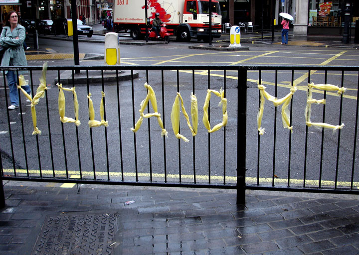
A very fine example of a public declaration of love, without vandalism…
I’m wondering if I shouldn’t start collecting this type of urban love messages. But surely someone has already published a book on this?
No design sign
When you walk around city centres you have to wonder if we need all that signage and graphic design. Often too slick, too loud and too perfect, over-designed corporate identities and graphics take away the human side of things. Maybe there are too many designers around that need to find work (and not enough courageous businesses).
Accidental map
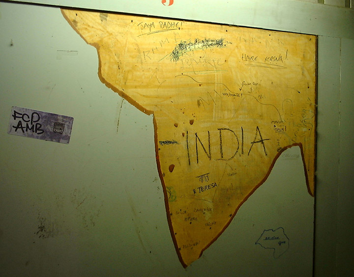
Within the chaos of one of the many Brussels train stations I found India (and I wasn’t the first one)
- Map of India






leave a comment