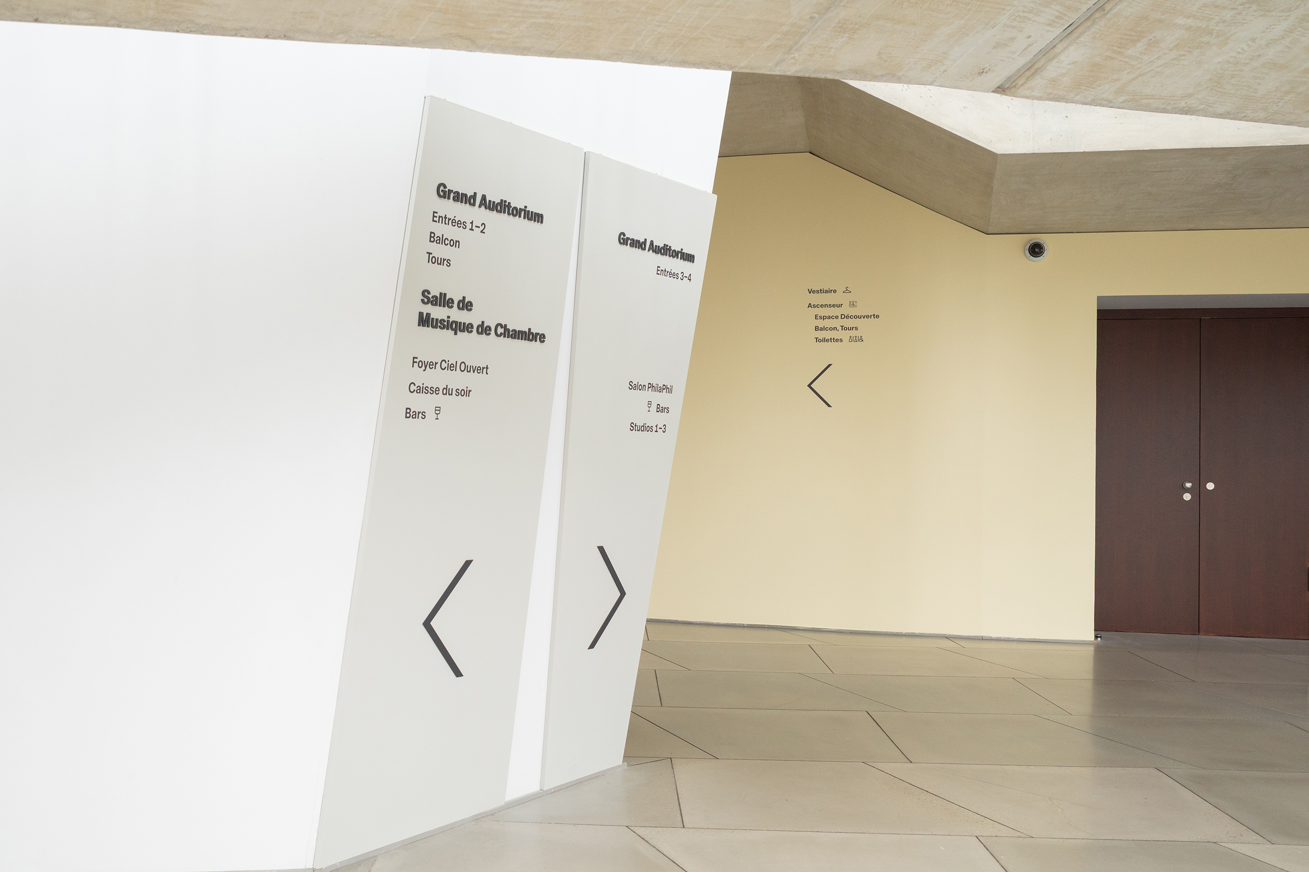
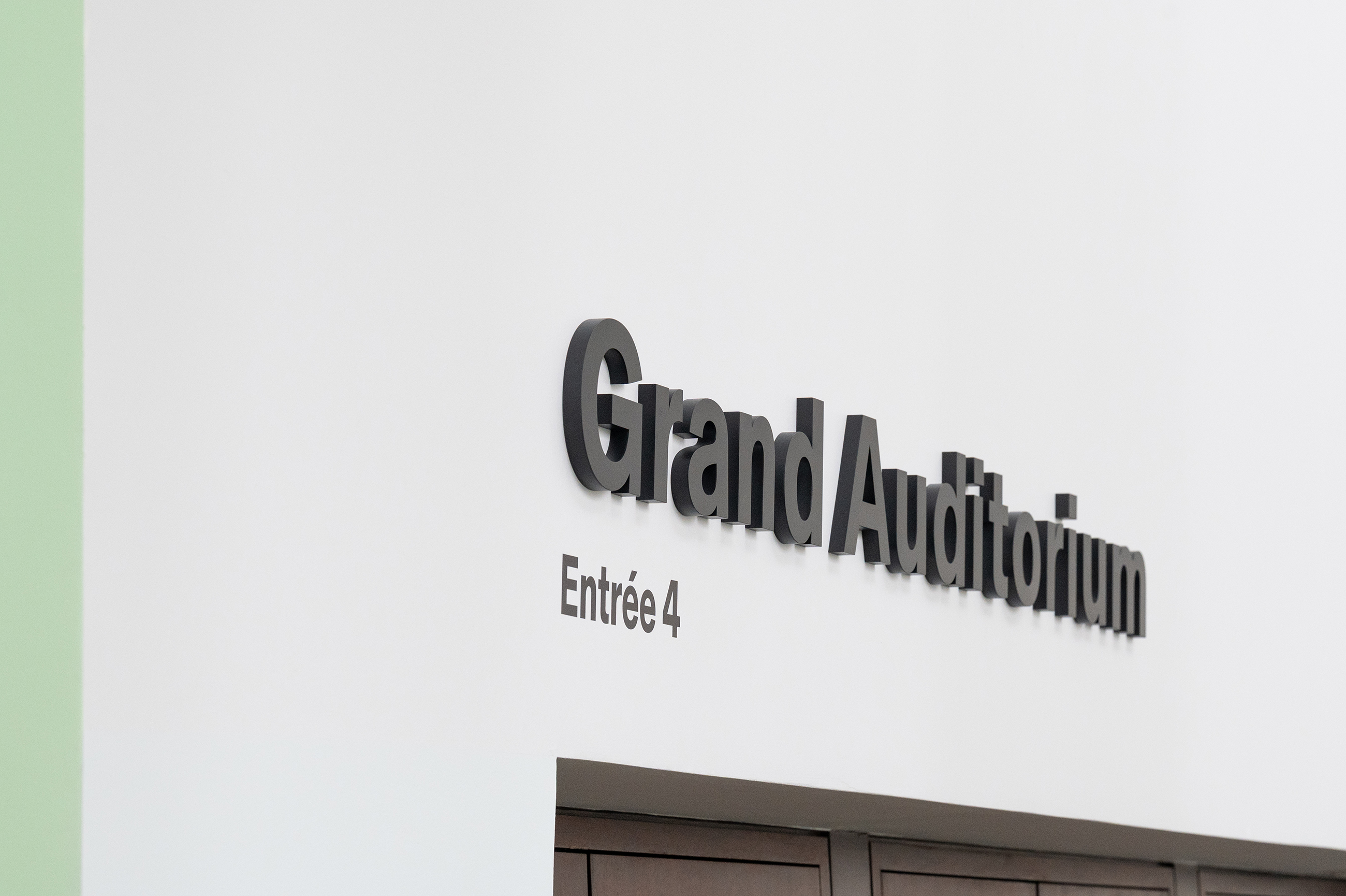
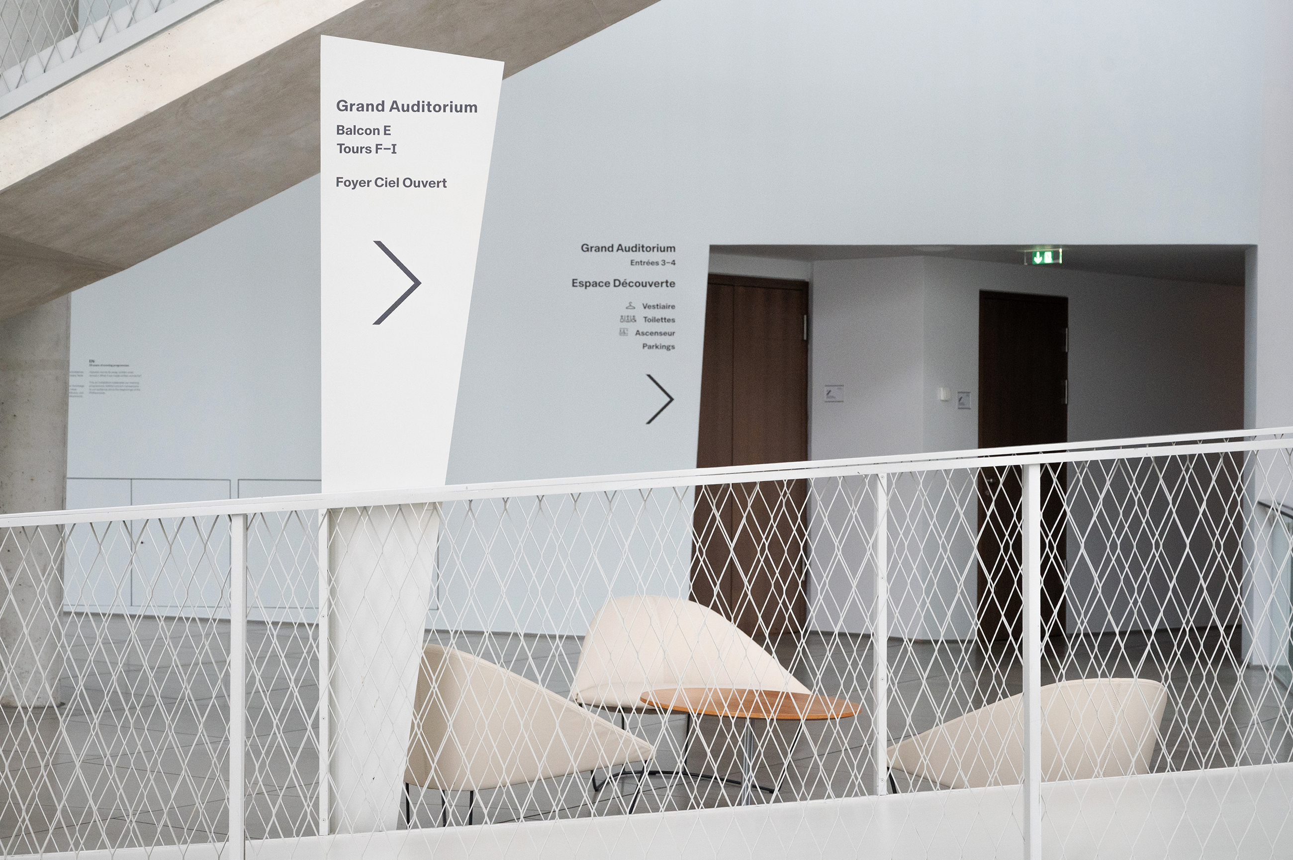
New Philharmonie Luxembourg signage project
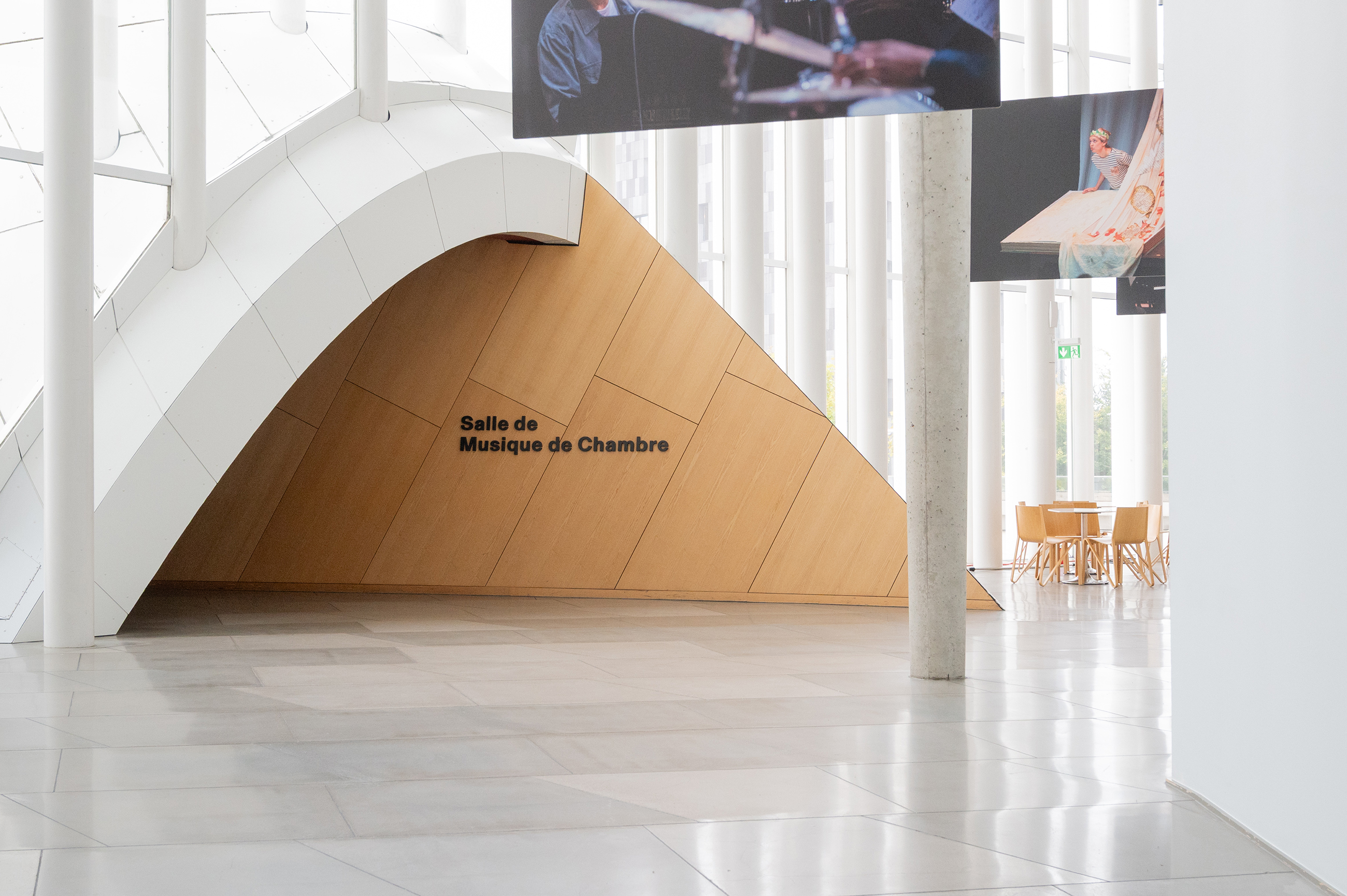
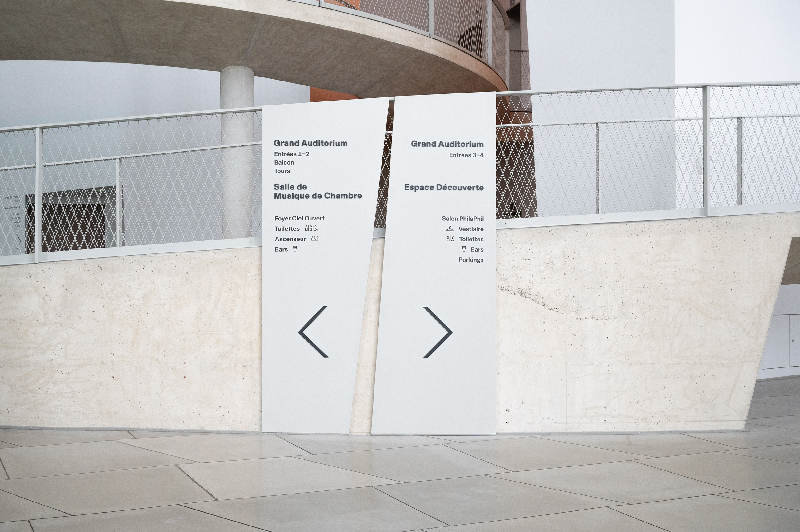
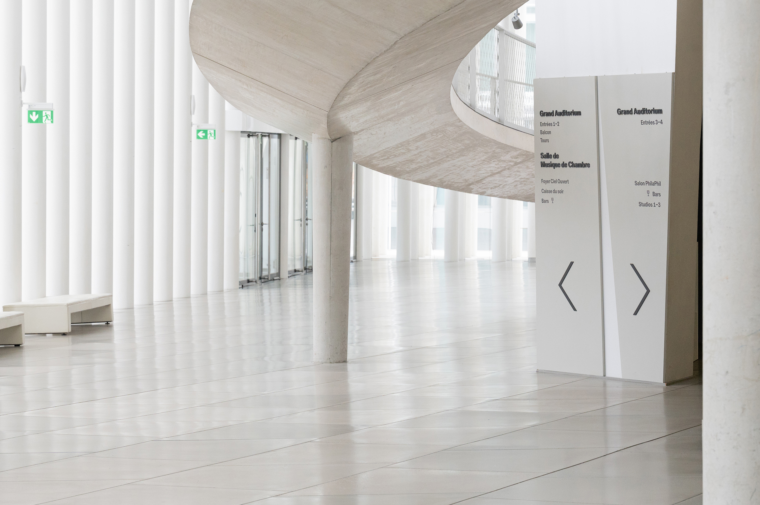
We were asked by the Philharmonie Luxembourg to rethink and overhaul the existing signage of this amazing building, designed by architect Christian de Portzamparc and inaugurated in 2005. The process of designing a coherent signage scheme in this complex building, which has almost no straight walls ( if there were any walls at all ) and no level floors, was one of our biggest design challenges so far. In fact, the angled asymmetrical walls, slopes, tunnels, towers and a circular circuit made our heads spin more than once. In close collaboration with the Philharmonie team, it took a year of structuring a new hierarchy, changing denominations, testing mock-ups, trials & errors, to develop a new concept.
The new design scheme had to find numerous specific three dimensional support solutions in order to have a minimal impact on the architecture and integrate into the very specific formal language of the building. Throughout the design development we followed our initial intention of trying to be as subtle as possible, yet at the same time, to be clearly visible and confident where required. Ultimately we arrived at an overall scheme that feels like it has always been part of the building, intuitive for the visitor and in accord with the architecture.
Client: Philharmonie Luxembourg
Graphics: Laurent Daubach / Designbureau


All photos © Philharmonie Luxembourg / Inês Rebelo de Andrade
Signage & street furniture design
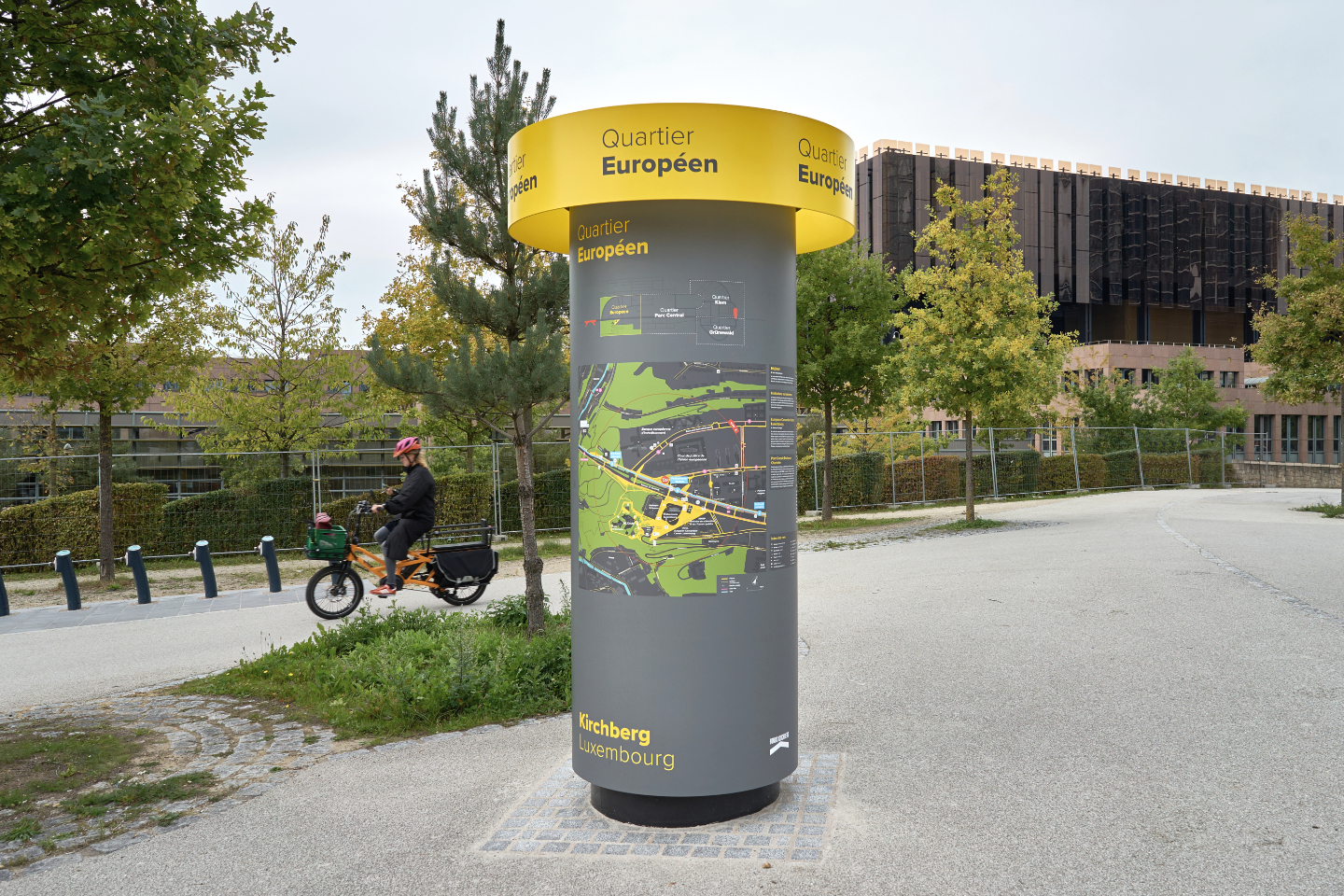
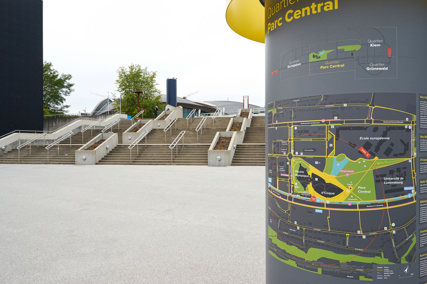


After developing a comprehensive urban signage and wayfinding concept for the Kirchberg area in Luxembourg-city, the scheme has now been implemented at all strategic locations & tram stations across the area.
The graphics, information and city map have been developed in compliance with stringent future accessibility guidelines and go way beyond the standards in terms of contrast and readability requirements.
The implementation and future changes of the map can be done independently by the client within their existing IT capabilities to ensure the high level of adaptations required for a fast changing urban area.
The overall concept consists of a system of bespoke designed elements, adapted to different urban scales and their context. The illustrated Morris column type street furniture is also bespoke and build in mostly untreated aluminium to enable the recycling of the raw material without additional treatments.
Client: Fonds Kirchberg, Luxembourg
Concept & design strategy: Georges Zigrand Design Consultancy
Graphic design: Laurent Daubach, Designbureau
Cast bronze signage


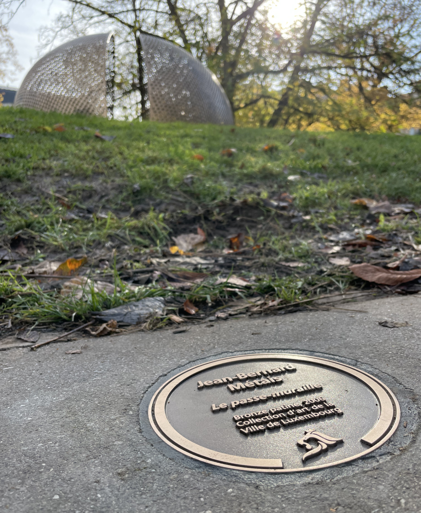

We have designed a new signage system to label the public space Art collection of the City of Luxembourg. The new system is based on a circular bronze cast that is mounted flush into the ground. The circular format allows for a much more flexible and non-aligned positioning in space, to fine-tune and orientate the information within pavings and to respond to often complex spatial environments. We wanted the signs to be visible enough for the urban stroller while not being too visible in the urban space. The Art collection being from different periods over the last 80 years our aim was also to make it look and feel like it has always been there, reflected in this traditional technique often used in public Art.
For the installation, only standard tools are required, using a common core drill with a standard width for fast and efficient implementation. Last but not least, the new signage is also reducing maintenance and de-cluttering the urban space.
Concept & product design: Georges Zigrand Design Consultancy
Graphics: Laurent Daubach / Designbureau
Client: Ville de Luxembourg, Coordination Culturelle
Castings: Fonderie Massard
You are here

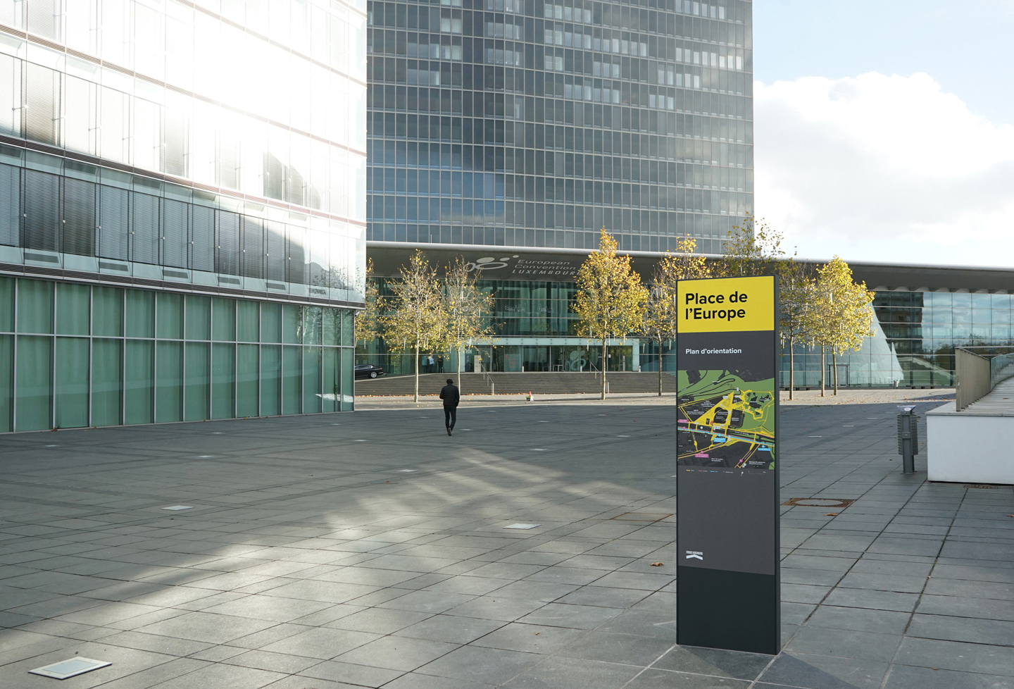
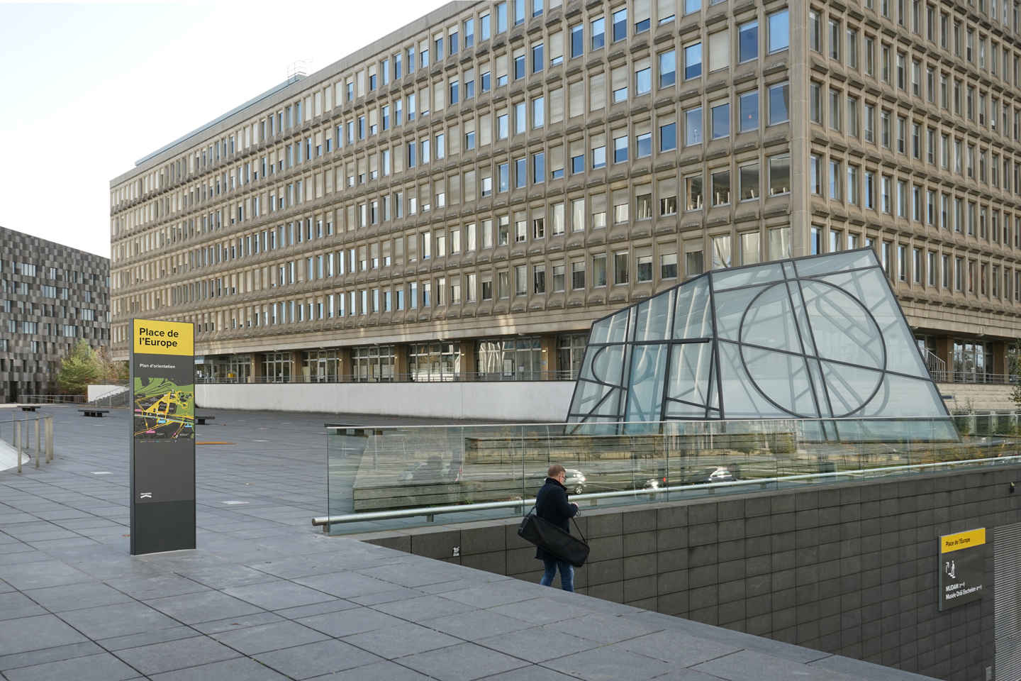

After developing a comprehensive wayfinding concept for the Kirchberg area in Luxembourg-city, and a prototype at the Central Parc, we have now rolled-out the first module of our system at the Place de l’Europe. The overall concept consists of a family of modules adapted to different urban scales and their context. The implementation of the signage system across the area is planned over the coming 12 months.
Graphics, text and city map have been developed in compliance with stringent future accessibility guidelines and go way beyond the standards in terms of contrast and readability requirements.
Any future changes of the map can be done independently by the client within their existing IT capabilities to ensure the high level of adaptations required for a fast changing urban area.
Client: Fonds Kirchberg
Concept & design strategy: Georges Zigrand Design Consultancy
Graphic design: Laurent Daubach, Designbureau
When car users become pedestrians again..
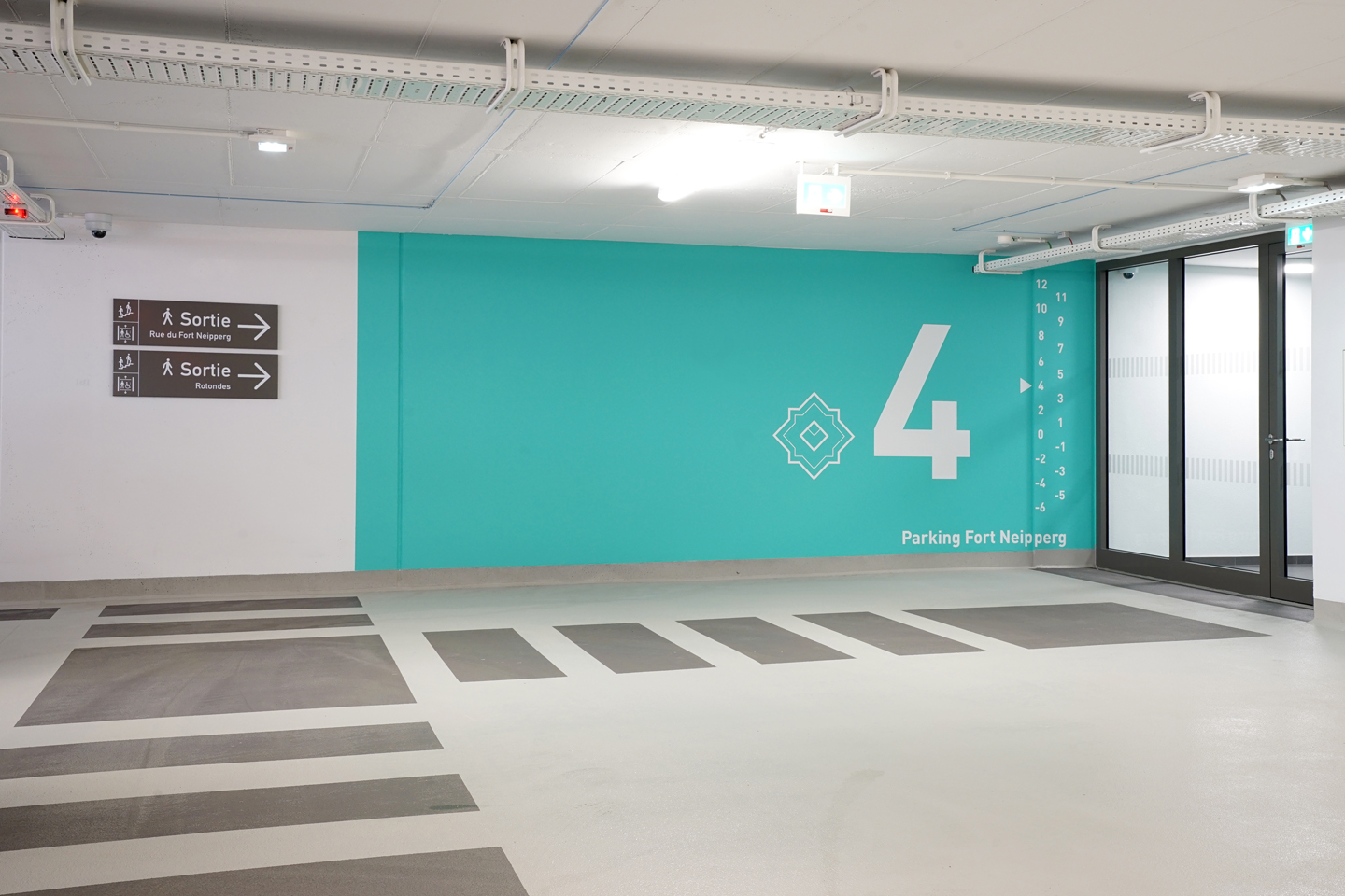


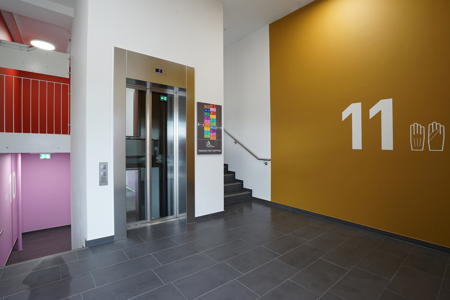
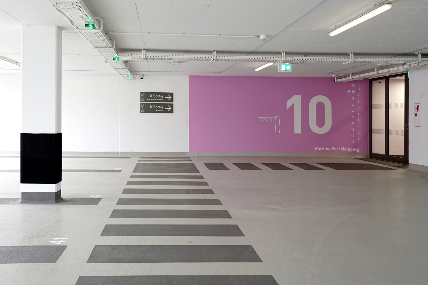
After developing a comprehensive new signage strategy & design manual for all the city of Luxembourg’s car parks (almost 20 different structures), Fort Neipperg, the first renovated car park has now opened to the public with our implemented design strategy.
Our user-focused approach has been to establish a clear hierarchy of the information and to prioritise on the more vulnerable, pedestrian user ( the driver / user outside the car). We separated the signage system for drivers & pedestrians for clarity and reduced the graphic interventions & colours to a strategic minimum to maximise their effectiveness. Our main aim was to make the perception of the space and the navigation within the space as intuitive as possible.
Floor level information consists of a range of carefully selected bright colours, in conjunction with illustrations and large scale numerals. They are only indicated on the exit stairs bloc, creating an intuitive ‘visual pull’ towards them.
Client: Ville de Luxembourg, Service Ouvrages d’Art, Génie Civil, Constructions
Concept & design strategy: WW+ Architektur & Georges Zigrand Design Consultancy
Graphic design: Laurent Daubach
Illustrations: Linda Bos
Hartlepool shows the way
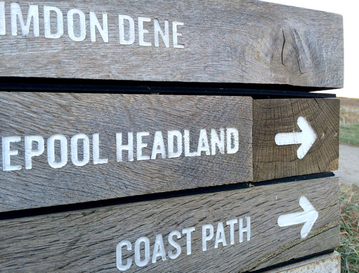
Very robust and beautifully simple coastal path signage between Hartlepool Headland and Crimdon Dene, North East England
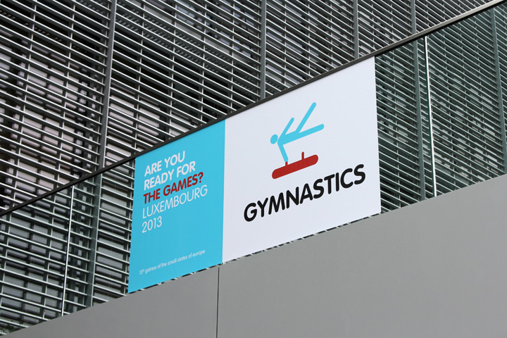
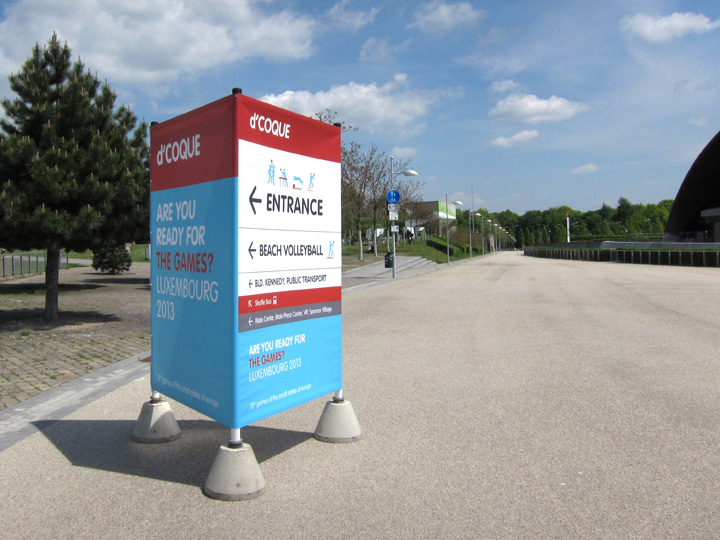
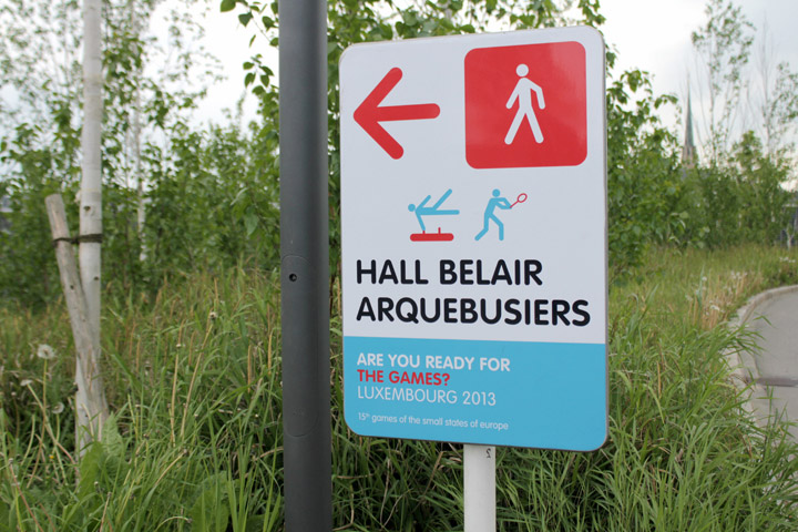
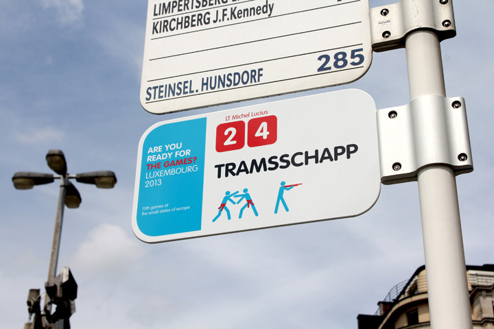
Fair games
Just finished a signage & wayfinding project for the Olympic Games of the Small Nations of Europe, held in Luxembourg this year. Very refreshing to work on a fast and short term project for a change. In collaboration with Luxembourg based Designbureau. Client: Comité Olympique et Sportif Luxembourgeois


Pondicherry shows the way

Some years ago I took this photo in the city of Pondicherry, India. Amazingly low-tech this hand-painted and sculptural road sign shows the way, also by its expressive and truly functional shape. Love it!
Vacation-land 2

This is the map on the reverse of the 1952 brochure. Great wood carving style graphics, great colours, great graphic treatment of our neighbouring countries!
The tourist attractions in the 50’s seem overwhelmingly to centre around outdoor activities like walking, kayaking and hunting… all of that surrounded by deep woods and medieval castles. I can’t help thinking that this is still our most valued tourist capital (minus hunting), certainly in terms of branding & positioning. Whilst promoting the country as a shopping or contemporary arts destination still has some way to go we should cherish, cultivate and promote the real gems that are unique to Luxembourg.
Graphic designer: Pe’l Schlechter
Schiphol airport signage
It doesn’t take much and you would miss your plane if you wouldn’t have this information. Even so, it is amazing to see how many airports don’t include the required walking time to get to the gate.

Making our cities more child friendly
Brussels pedestrian crossing. Another example of the low budget yet convincing Belgian way.


leave a comment