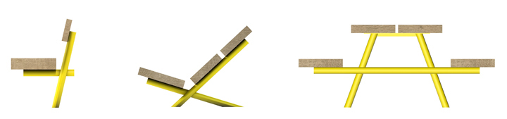
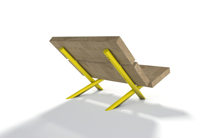
Outdoor furniture – extra bold
Designed for outdoor spaces like nature reserves, parks & forests, this seating range is composed of large & chunky shapes with very simple profiles. The large – single piece – wood parts are made from locally sourced oak trunks with a simply sawn finish to resist weathering and vandalism. Due to its thickness, the wood can be sanded down if damaged but can also happily live with the added texture.
The wood profiles and tubular powder coated steel tubes are both an integral part of the structure and form objects with a strong visual contrast between natural and man made materials. The simple & sculptural shapes should integrate well in natural environments, yet stand out enough to be noticed for its quality.


Have a seat and enjoy
The City of Luxembourg commissioned us to develop an furniture and colour guidance manual for the terrasses on one of it’s most prestigious squares in the city centre. After many years of wild west behavior of the restaurants and cafés, using mostly cheap looking plastic furniture, branded umbrellas, primary colours and endless clutter the city wanted to clean up.
The new scheme, involving a selection of muted colours and more attractive furniture typologies has now been implemented, giving the square a more dignified and calm appearance while focusing on the quality of the space, the trees and the architecture.
One of press critics wrote at the time that we want to take colour and life out of the City, thankfully the chap in his all red training outfit plus hat has turned-up on my photo (on the right) to prove that it is not furniture & umbrellas that are creating a colourful city life!


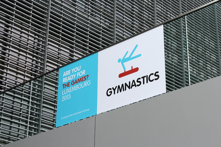
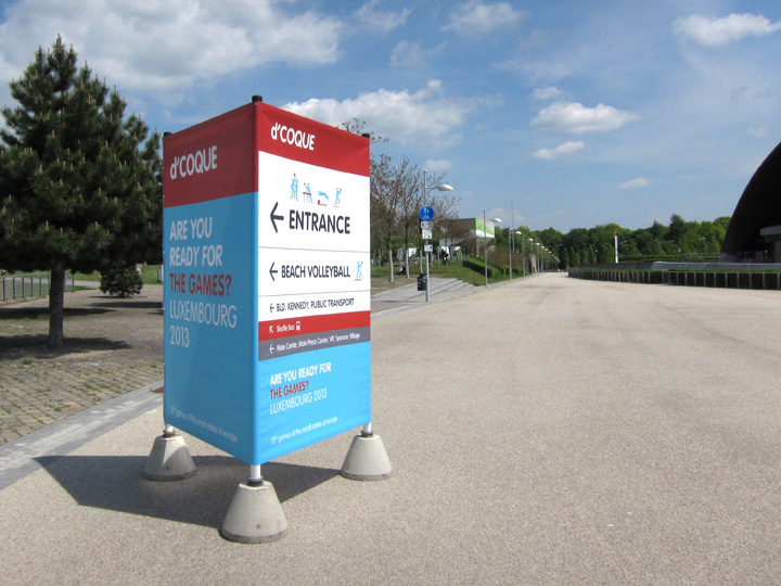
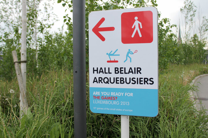
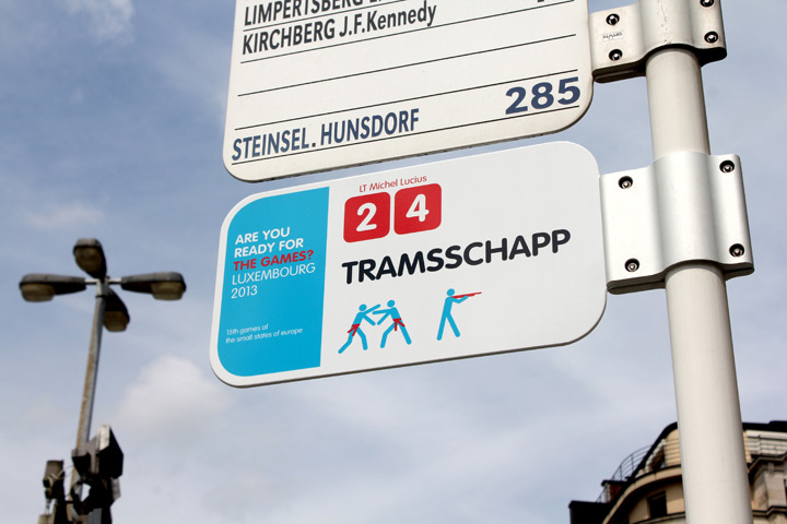
Fair games
Just finished a signage & wayfinding project for the Olympic Games of the Small Nations of Europe, held in Luxembourg this year. Very refreshing to work on a fast and short term project for a change. In collaboration with Luxembourg based Designbureau. Client: Comité Olympique et Sportif Luxembourgeois


-… – .-.. — –. —
Matching graphics
 “Your penny is worth more at the Cooperative supermarket” is a great slogan, and the graphics on these match boxes are even better. Not sure from which period this is ( I would guess late 70’s early 80’s), but I wish retail graphic design would more often be this convincingly simple, minimal, bold & confident (even if it looks a bit communist).
Eau de Luxembourg

This water drinking fountain is the first of many to be installed in the City of Luxembourg. The scheme was initiated by the city’s own Service des Eaux and elaborated in close collaboration with the City Management, other administrations of the city and myself as an external design consultant.
After an in-depth research of existing drinking fountains across Europe we have identified this fountain as the most suitable product for Luxembourg. The fountain has initially been developed by the french designer Cécile Planchais for Eau de Paris and will also be rolled-out in Paris next year.
Besides the functional & hygienic qualities its subtle timeless design has convinced us to be the right choice for Luxembourg. The textured surface and distinctive shape blurs the boundaries of time, making it contemporary but also fit nicely in an heritage environment. Also, after two days in use in the city the form and shape has proven that its function and purpose is self-explanatory.
Quality banking

Interior concept for the 74 branches of the Banque et Caisse d’Epargne de l’Etat, a national institution in Luxembourg – designed by Teisen-Giesler Architectes & Georges Zigrand Design Consultancy
We elaborated a scheme conveying the notion of safety, tradition, quality and long established values. By emphasising solid build elements made from cast terrazzo and oak we underlined the trustworthy image of the bank. Timeless shapes and high quality materials should also underline the fact that the bank, with it’s long history, is here to stay.
The design proposal were elaborated following an closed competition initiated by the BCEE.
paperJam TV set design
 Luxembourg based media group ‘Maison Moderne’ has commissioned me to design a TV set for its new venture, paperJam TV.
The design concept is based on an intricate curtain wall featuring numerous cut-outs based on the pattern of the existing paperJam logo. The idea was to create a notion of visual depth and shadows that ‘texture’ the background in an otherwise extremely confined space (4,5m X 3,5m). The pattern also helps to blur the scale and make the space appear larger then it really is.
Additionally we installed RGB LED’s to graze up the walls behind the hanging ‘curtains’. These LED’s are individually addressable, enabling the background to be animated by gently pulsating and changing colour schemes.
Photo: © Olivier Minaire / Maison Moderne (TM)
paperJam TV: www.paperJam.TV
Vacation-land

I found this 1952 tourism brochure at a car boot sale in Belgium. Grand-Duchy of Luxembourg – vacation-land is a great slogan, the land of leisure and pleasure! I also like the wood carving style font and the friendliness that transpires through the illustrations. Although the message is very simple I think it still works today!
Please check-out the post below with the map on the opposite side of this page.
Vacation-land 2

This is the map on the reverse of the 1952 brochure. Great wood carving style graphics, great colours, great graphic treatment of our neighbouring countries!
The tourist attractions in the 50’s seem overwhelmingly to centre around outdoor activities like walking, kayaking and hunting… all of that surrounded by deep woods and medieval castles. I can’t help thinking that this is still our most valued tourist capital (minus hunting), certainly in terms of branding & positioning. Whilst promoting the country as a shopping or contemporary arts destination still has some way to go we should cherish, cultivate and promote the real gems that are unique to Luxembourg.
Graphic designer: Pe’l Schlechter

leave a comment