
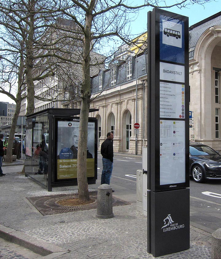
A new bus shelter for Luxembourg-city
Based on an existing JCD shelter designed by Norman Foster we fine-tuned & adapted the design in collaboration with the city and JCD to better fit todays user needs. Over 250 shelters will be installed / replaced the next couple of years across the city’s bus network.
With a user-centered approach the team developed a new back-lit independent totem that regroups a number of information that is easy to read, even from a distance. The same logic applies to the glass panel on the opposite side where we also re-grouped passenger information usually spread randomly all over the shelter.
-… – .-.. — –. —
DIY magic
 Magic tape must be one of the best office inventions after the post-it. In combination with low-budget DIY needs it becomes even more magic, as I’ve noticed on this door of an Architects studio in Barcelona…
Paris bashing
It is well known that the bistro culture in Paris is a league on its own, sitting tightly packed on street corners, coffee & cigarettes, waiters that don’t care, gazing at the people passing by …
The typical Paris bistro table with a single foot and an oversized thin metal edging embodies this way of life quite well for me. Every bash and knock the metal edging gets adds character & texture to the table, making it age gracefully without aspiring to be perfect.

Matching graphics
 “Your penny is worth more at the Cooperative supermarket” is a great slogan, and the graphics on these match boxes are even better. Not sure from which period this is ( I would guess late 70’s early 80’s), but I wish retail graphic design would more often be this convincingly simple, minimal, bold & confident (even if it looks a bit communist).
Cheap & cheerful

Creating a street stall for a one day event to sell hand made scarves from Bangladesh is not my usual design brief, especially if the budget had to be kept at an absolute minimum. But there is always a way, even if it means going to the DIY shop..
Scarves designed by Luxembourgish designer Anne-Marie Herckes with the assistance of the Vocational Training and Employment Generation Project of the NGO ‘Friendship’.
RAL 2005 Leuchtorange

Another beautifully functional colour, RAL 2005 is the standard safety orange for sea rescue boats.

Eau de Luxembourg

This water drinking fountain is the first of many to be installed in the City of Luxembourg. The scheme was initiated by the city’s own Service des Eaux and elaborated in close collaboration with the City Management, other administrations of the city and myself as an external design consultant.
After an in-depth research of existing drinking fountains across Europe we have identified this fountain as the most suitable product for Luxembourg. The fountain has initially been developed by the french designer Cécile Planchais for Eau de Paris and will also be rolled-out in Paris next year.
Besides the functional & hygienic qualities its subtle timeless design has convinced us to be the right choice for Luxembourg. The textured surface and distinctive shape blurs the boundaries of time, making it contemporary but also fit nicely in an heritage environment. Also, after two days in use in the city the form and shape has proven that its function and purpose is self-explanatory.
Pondicherry shows the way

Some years ago I took this photo in the city of Pondicherry, India. Amazingly low-tech this hand-painted and sculptural road sign shows the way, also by its expressive and truly functional shape. Love it!
Quality banking

Interior concept for the 74 branches of the Banque et Caisse d’Epargne de l’Etat, a national institution in Luxembourg – designed by Teisen-Giesler Architectes & Georges Zigrand Design Consultancy
We elaborated a scheme conveying the notion of safety, tradition, quality and long established values. By emphasising solid build elements made from cast terrazzo and oak we underlined the trustworthy image of the bank. Timeless shapes and high quality materials should also underline the fact that the bank, with it’s long history, is here to stay.
The design proposal were elaborated following an closed competition initiated by the BCEE.
Bring back the craftsmanship – Art & Craft

Photo by Richard-Max Tremblay
Another fine example of upholstery craft – by the artist Yannick Pouliot in his work Régence: monomaniaque.
Bring back the craftsmanship – upholstery

Good craftsmanship is key to produce fine quality objects. Unfortunately, outside the luxury industry, they are hard to find. With labour costs going constantly up are we loosing all the fine techniques that made objects special? It seems a shame, but it motivates me even more to collaborate with skilled craftsmen on the next projects!
Here’s one I did earlier

While clearing my cellar I stumbled over the box of furniture models from my diploma project dating back to 1998. Although this is a scarily long time ago I still like the design.
Above model of an office desk made from plywood & industrial rubber.
Seaside beauty

I am again and again fascinated by the beauty of engineering projects. This mold / matrix to cast a sea defence wall is one of these examples where the beauty of making these structures is almost more interesting then the final result. It also makes you wonder why not more adventures structures are being cast.
Beads & buttons fun

I saw this ingenious way of displaying buttons in a Madrid shop. The big wheely device looks more like something from a fun fair and turns at will in order to best view all the buttons on display.
This principle could also be used in many other contexts like interpretative devices in museums …etc. And of course as a way of visually displaying information on the i-phone…
paperJam TV set design
 Luxembourg based media group ‘Maison Moderne’ has commissioned me to design a TV set for its new venture, paperJam TV.
The design concept is based on an intricate curtain wall featuring numerous cut-outs based on the pattern of the existing paperJam logo. The idea was to create a notion of visual depth and shadows that ‘texture’ the background in an otherwise extremely confined space (4,5m X 3,5m). The pattern also helps to blur the scale and make the space appear larger then it really is.
Additionally we installed RGB LED’s to graze up the walls behind the hanging ‘curtains’. These LED’s are individually addressable, enabling the background to be animated by gently pulsating and changing colour schemes.
Photo: © Olivier Minaire / Maison Moderne (TM)
paperJam TV: www.paperJam.TV
3D tiles
Outdoor ceramic tiles in the public realm always fascinated me, especially if they are in relief. They seem to be such a good solution for buildings, street furniture and walls. There is an almost endless scope of design options; texture, pattern, light reflection, colour ..etc. The slide show shows examples from Belgium (Ostend), Portugal (Cascais) & France (Le Tréport).
If any reader knows of other fine examples, please let me know. I would like to collect more images and hopefully I can post a more comprehensive collection of examples in the near future.
Vacation-land

I found this 1952 tourism brochure at a car boot sale in Belgium. Grand-Duchy of Luxembourg – vacation-land is a great slogan, the land of leisure and pleasure! I also like the wood carving style font and the friendliness that transpires through the illustrations. Although the message is very simple I think it still works today!
Please check-out the post below with the map on the opposite side of this page.

leave a comment